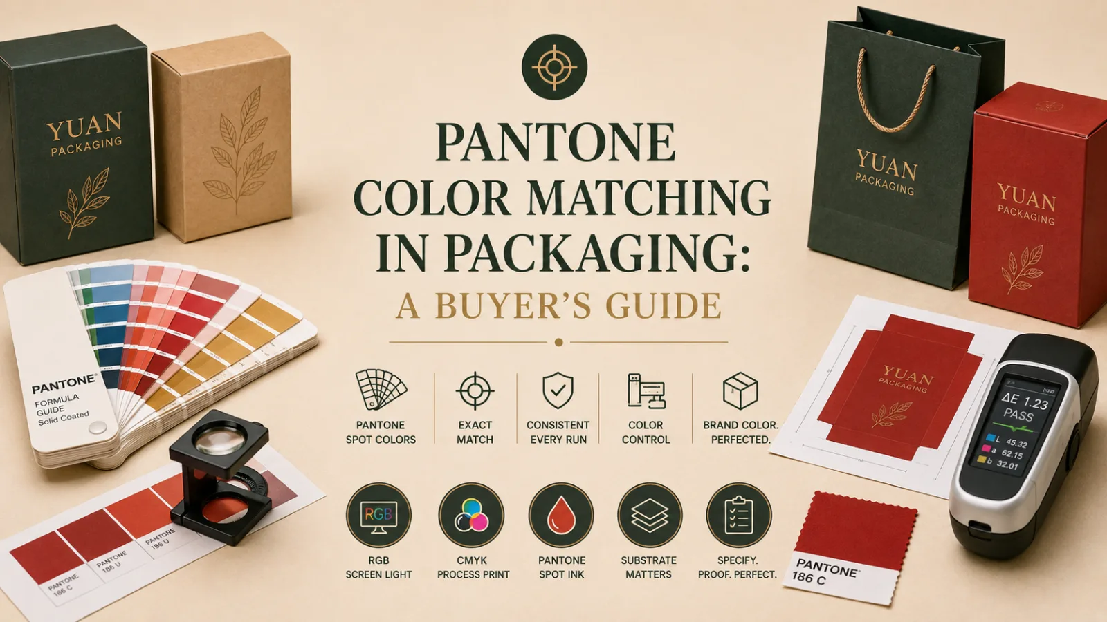
For most brands, colour is equity. A signature red or a precise gold is part of how customers recognise the brand, and the moment it shifts on a printed box, the brand looks slightly wrong even if no one can say why. The gap between the colour on a designer’s screen and the colour on a finished carton is where brands get caught out — and Pantone colour matching is how that gap is closed. This guide explains how it works and how to specify colour so your packaging comes out exactly as intended.
The starting point is understanding why screen and print disagree. Screens display colour in RGB — light, with a very wide range. Most packaging is printed in CMYK, a four-colour process that mixes cyan, magenta, yellow, and black, and which simply cannot reproduce some of the colours a screen can show, particularly vivid or specific brand shades. A bright brand colour that glows on a monitor can land dull or shifted in CMYK — not a fault, just the limit of the process.
Pantone — the PMS, or Pantone Matching System — solves this with pre-mixed spot inks. Each Pantone colour is a standardised recipe: rather than building the colour from four process inks, the press runs a single ink mixed to that exact standard. Because the recipe is fixed and recognised worldwide, a Pantone colour reproduces consistently across runs, suppliers, and countries. For a brand-critical colour, that consistency is the whole point.
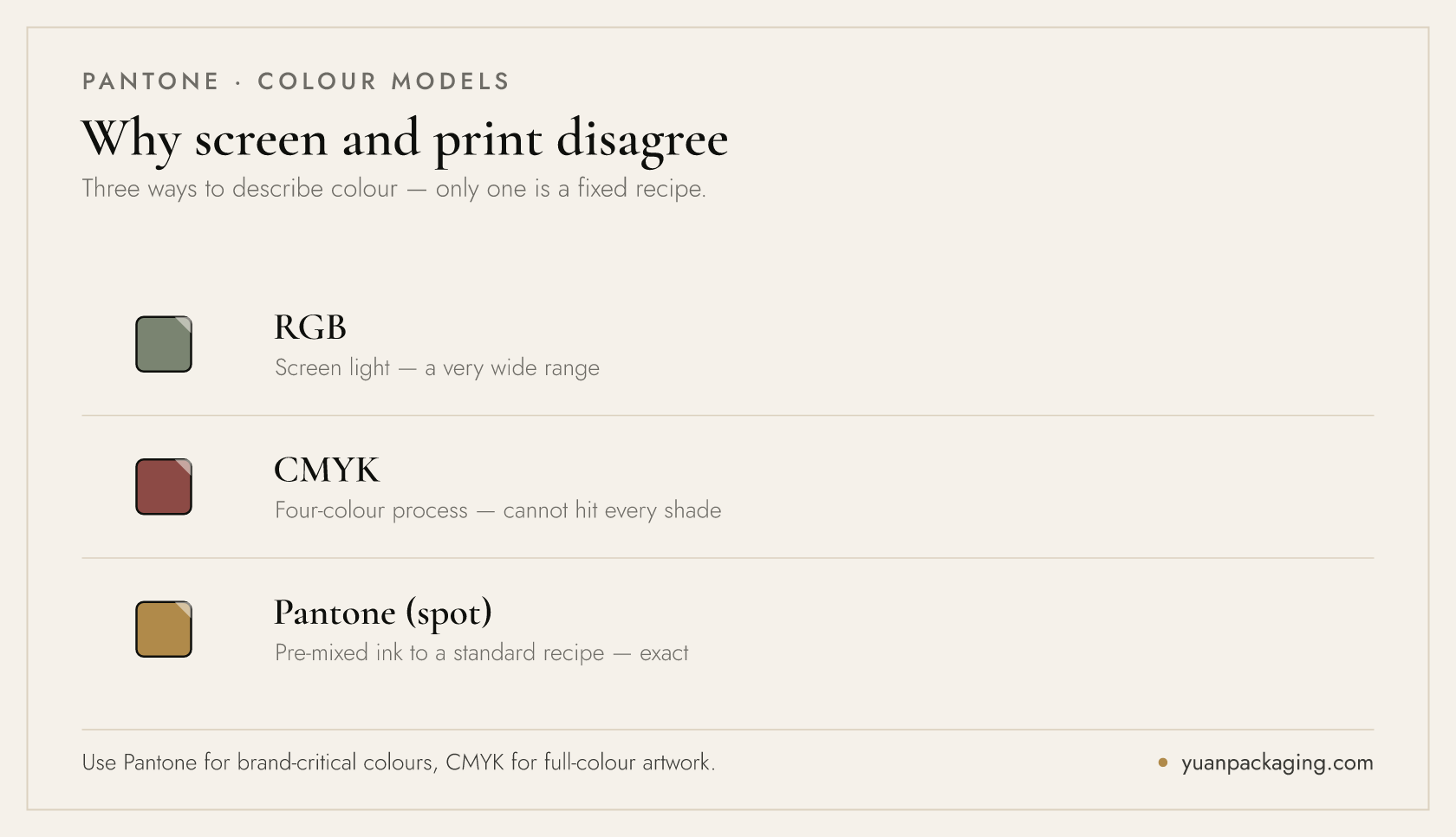
You do not need Pantone for everything. Use it for brand-critical colours — a logo red, a signature gold, a precise corporate blue — where exactness matters. Use CMYK for photographic and full-colour artwork, where process printing is the right tool. Many packaging jobs use both: process colour for imagery plus one or two Pantone spot colours for the brand elements that must be exact. This is a normal, cost-effective way to specify a job. US brands can see how we hold colour across the distance, and what to write into a specification, on our United States sourcing page.
Discuss your packaging project
One detail trips up many buyers: coated versus uncoated. The same Pantone number looks noticeably different on coated stock (the “C” suffix, e.g. Pantone 186 C) versus uncoated stock (the “U” suffix), because the paper surface changes how ink sits and reflects. Always specify the suffix that matches your substrate, and expect a textured or uncoated material to render a colour softer than a glossy coated one. The substrate is part of the colour, not just a background.
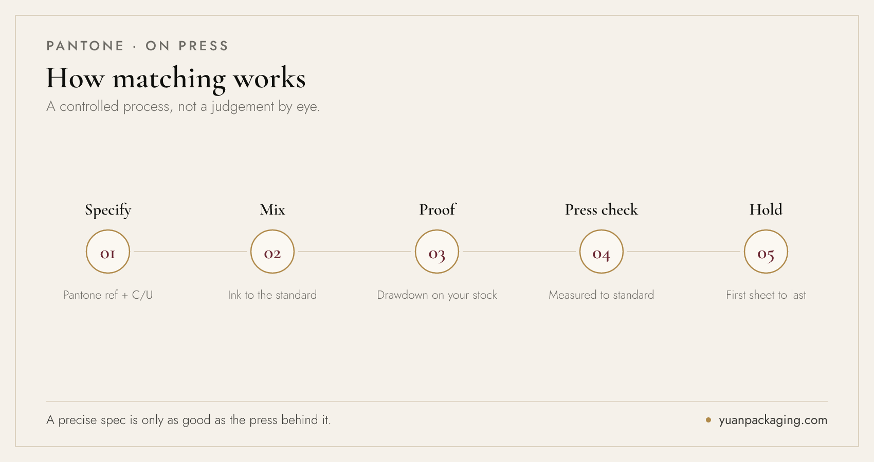
On press, matching is a controlled process. The ink is mixed to the Pantone standard, a drawdown or proof is produced on your actual stock and approved, and during the run the press operator checks colour against the standard — increasingly measured with a spectrophotometer rather than judged by eye — to hold it from the first sheet to the last. This discipline is what separates packaging that matches the brand from packaging that is merely close.
A calibrated press matters as much as the specification. Colour consistency across a long run, and across reorders months apart, depends on equipment and process control — which is why we run a colour-managed workflow on presses such as our Koenig & Bauer Rapida. A precise Pantone spec is only as good as the press and the measurement discipline behind it.
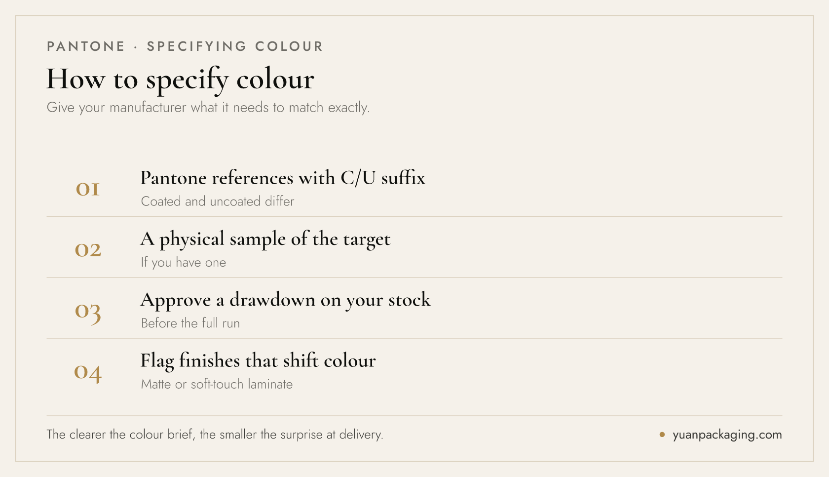
To specify colour well, give your manufacturer the Pantone references with the correct coated or uncoated suffix, supply a physical sample of the target colour if you have one, and approve a drawdown or proof on your actual substrate before the full run. Flag any finishing — a matte laminate or soft-touch coating will shift the perceived colour — so it can be accounted for. The clearer the colour brief, the smaller the surprise at delivery.
At volume, colour discipline becomes mission-critical. A signature shade has to hold across hundreds of thousands of cartons and across every reorder in an annual programme — a drift that is invisible on one box is glaring across a shelf of them. This is where calibrated process and measurement earn their place, and why colour management sits at the centre of how we run high-volume brand packaging.
In short: specify brand-critical colours in Pantone, mind the coated/uncoated suffix, approve a physical proof on your real stock, and work with a colour-managed manufacturer. Do that and your brand colour will be the same on the last carton as the first. If you want help specifying colour for a packaging project — or a drawdown on your chosen stock — tell us about your project and our prepress team will guide it.
Frequently Asked Questions
What is the difference between Pantone and CMYK?
CMYK is four-colour process printing that mixes cyan, magenta, yellow and black, and cannot reproduce every colour. Pantone (PMS) uses a single pre-mixed spot ink made to a standardised recipe, so a brand-critical colour reproduces exactly and consistently across runs and suppliers.
Why does my packaging colour look different from my screen?
Screens show colour in RGB (light, very wide range) while packaging prints in CMYK, which cannot reproduce some vivid or specific shades. Specifying a Pantone spot colour for brand-critical elements, and approving a physical proof, closes the gap between screen and print.
What does coated vs uncoated (C/U) mean for Pantone?
The same Pantone number renders differently on coated stock (the “C” suffix) versus uncoated stock (the “U” suffix), because the paper surface changes how ink reflects. Always specify the suffix that matches your substrate, and expect uncoated or textured materials to look softer.
How do I keep my brand colour consistent across reorders?
Specify the colour as a Pantone reference with the correct C/U suffix, approve a drawdown on your actual stock, and work with a colour-managed manufacturer that measures colour on press. This holds a signature shade across long runs and across reorders months apart.