Packaging Materials & Board Types
The substrate decides more about a finished pack than most briefs assume — how the print reads, how the edges look, what finishing is worth paying for, and how the box feels when someone picks it up.
Coated papers & boards
The default for full-colour print — smooth, accurate, and the ground most finishing is built on.
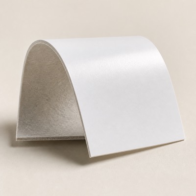
Coated One Side (C1S)
Coated on the printing face, uncoated on the reverse. The default carton and wrap board. You are paying for coating only where the print goes, so it is the economical choice whenever the inside face is not seen.
Coated Two Sides (C2S)
Coated on both faces for print inside and out. Specify when the inside of the box is part of the design — an unboxing reveal, a printed inner lid, or a sleeve seen from both sides.
Gloss Art Paper
A high-shine coated surface that lifts colour saturation. The strongest choice for photographic imagery and bright brand colours. Shows fingerprints and scuffs on dark artwork, so it is usually laminated.
Matt Art Paper
Coated but non-reflective, with a soft even surface. Easier to read than gloss under retail lighting, and the ground that spot UV and foil contrast against best.
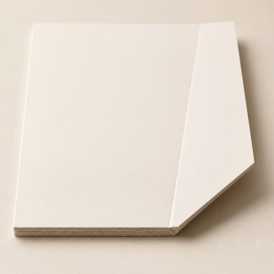
Ivory Board (FBB)
Bright folding boxboard with a smooth print face. The standard carton stock in cosmetics and pharmaceutical work — clean creasing, reliable folding, white enough for small regulatory type.
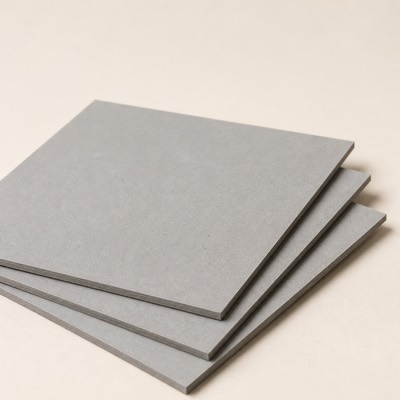
Greyboard
The dense structural core of a rigid box. Not printed — it is wrapped. Thickness is specified against the weight the box carries and the opening feel you want.
Uncoated & natural
Fibre you can feel. Softer print, honest surface, and the recycled and FSC grades live here.
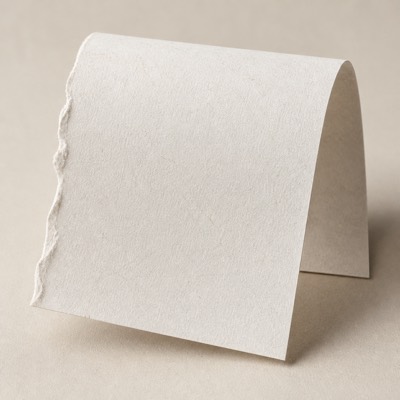
White Kraft
Strong uncoated white fibre with a natural surface. Reads honest rather than glossy, and takes one or two spot colours well. Recycled and FSC-certified grades are available where a materials policy applies.
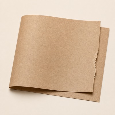
Natural Brown Kraft
Unbleached brown fibre, the recycled-content standard. The lowest-processing option we stock. Remember that the brown ground shifts every ink laid over it — colours need proofing on the actual stock, not on white.
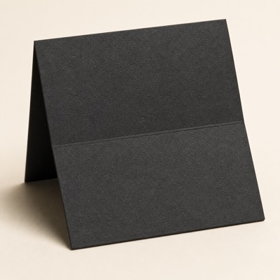
Black Kraft
Solid-dyed black board, black through the fibre. Dyed rather than printed, so a cut or scored edge stays black instead of flashing white. The usual ground for gold or silver foil work.
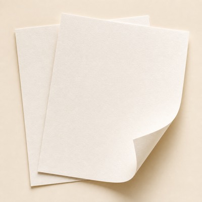
Uncoated Woodfree
A plain, unsealed paper surface. Ink sinks slightly, which softens photography but flatters type. Writable, which matters on care cards and certificates.
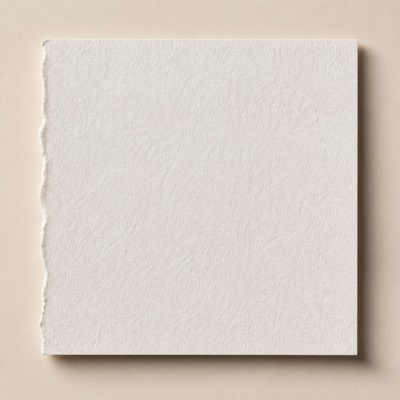
Cotton Paper
Cotton fibre rather than wood pulp — thick, soft and quiet. Takes a deep blind deboss better than any other stock we carry. Does not suit photographic print.
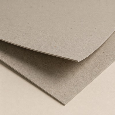
Recycled Content Board
Post-consumer fibre, visible in the surface. The speckle is the point — it reads as recycled without a label saying so. Colour varies between batches, which has to be accepted up front.
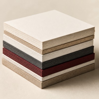
FSC-Certified Board
Chain-of-custody certified stock, available across most grades. Available coated, uncoated and kraft. Specify it at quoting stage — switching later can change both colour and price.
Textured & specialty
Surface doing the work instead of a finishing pass — often the cheaper route to the same impression.
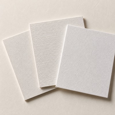
Textured & Felt-Marked
Embossed linen, laid and felt surfaces. Carries a tactile identity with no extra finishing pass. Print sits softer on texture — fine detail and photographic images lose bite, so it suits type and blind emboss better than imagery.
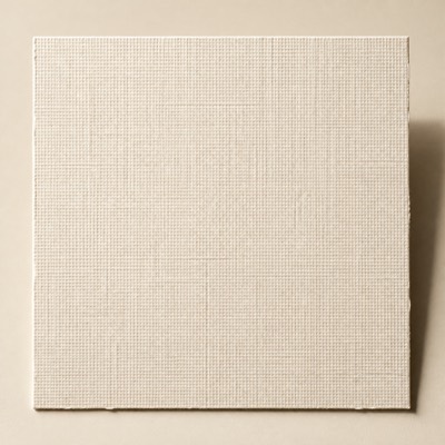
Linen Texture
A fine woven cross-hatch pressed into the sheet. The most widely recognised luxury texture, and the most forgiving — it hides handling marks that would show on a smooth board.
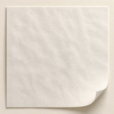
Felt-Marked
A soft irregular surface formed while the paper is still wet. Reads as handmade. Standard on wine labels, where it also helps the label survive condensation.
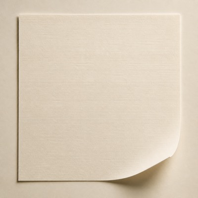
Laid
Fine parallel lines running through the sheet. Traditional and quiet. Works where linen would look too decorative — certificates, inner cards, letterheads.
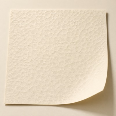
Hammered
A dimpled surface, as though struck. More texture than linen and more irregular. Foil sits on the high points, which produces a broken, aged metallic look.
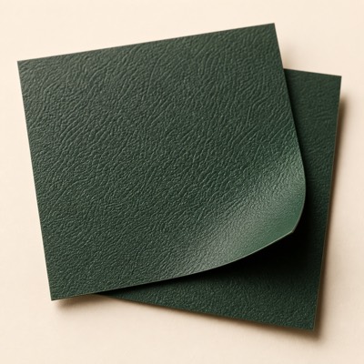
Leather Grain
An embossed hide pattern on paper. Used on rigid box wraps where the brief asks for leather without the cost, the weight, or the sourcing questions.
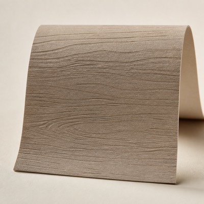
Wood Grain
A directional grain pattern embossed into the wrap. Reads warm close up. Grain direction has to be marked on the dieline or it runs the wrong way across a lid.
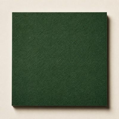
Suede / Cashmere Touch
A napped surface with a dry, soft hand. The tactile top tier in paper. Marks easily, so it suits gift packaging rather than anything handled repeatedly at retail.
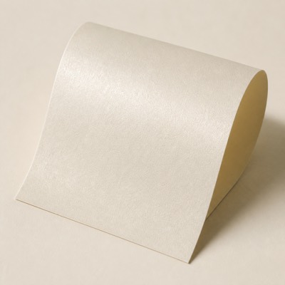
Pearl / Iridescent
A shimmer worked into the sheet itself. Subtler than metallised board, and it still takes ink normally — so photography survives on it where it would not on foil paper.
Metallic & effect
A metallic or diffractive ground across the whole sheet, instead of foiling one element of it.
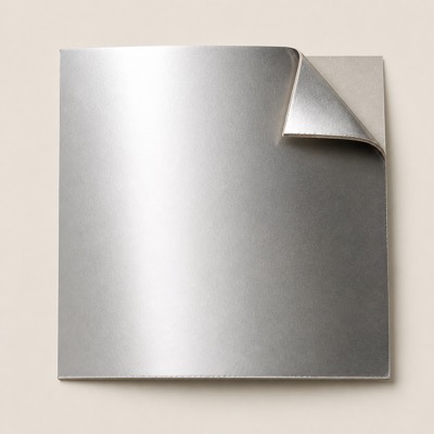
Metallic & Metallised
A reflective metallic ground across the whole sheet. Gives a metallic surface without a separate foil pass, which is usually cheaper when most of the design is metallic. Inks printed over it go translucent — that is the effect, but it has to be proofed.
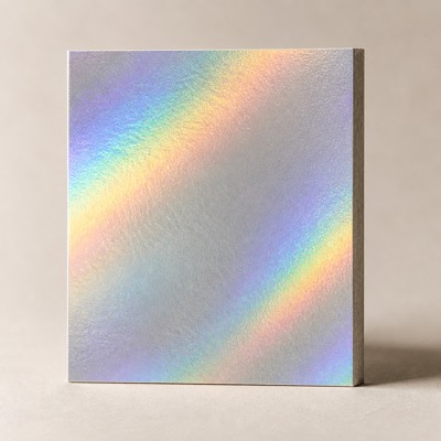
Holographic
Diffractive board that shifts colour with viewing angle. Decorative on a box; on a label, positioned holography registered to the artwork also serves as an authentication feature.
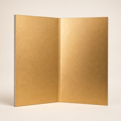
Metallised Gold
A gold metallic ground across the whole sheet. Cheaper than foiling a large area, and the effect is even rather than registered. Inks over it go translucent — proof it.
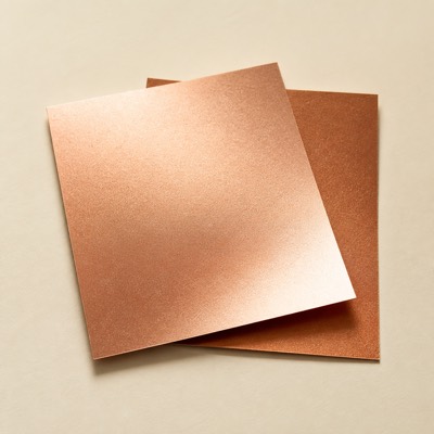
Rose Gold & Copper
Warmer metallic grounds in rose, copper and bronze. Reads softer than gold under warm retail lighting. Available as board or as a foil, depending on how much area it covers.
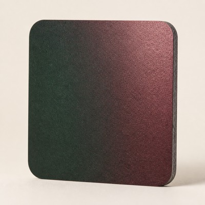
Colour-Shift
A ground that changes hue with viewing angle. Decorative on a box; on a label it doubles as an overt authentication feature a photocopy cannot reproduce.
Label face stocks
Self-adhesive papers. What the label is printed on, before the adhesive underneath it is chosen.
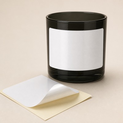
Semi-Gloss Paper
The default self-adhesive paper face stock. Economical, prints sharply, takes foil and emboss. Not for wet or oily surfaces — that is a film job.
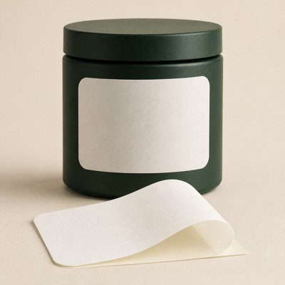
Matt Label Paper
Non-reflective paper face stock. Preferred where the label has to be written on — batch codes, dates, dispensing labels.
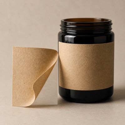
Kraft Label
Brown or white kraft face stock with a natural surface. The visual shorthand for artisanal. Prints one or two colours well; full-colour photography fights the brown ground.
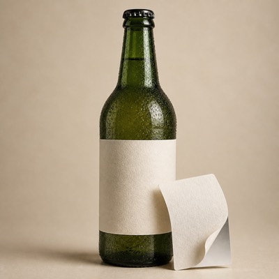
Wet-Strength Paper
Paper treated to hold together when saturated. The standard answer to chilled service and ice buckets. Test it under your own conditions before approval — the bucket is the real test.
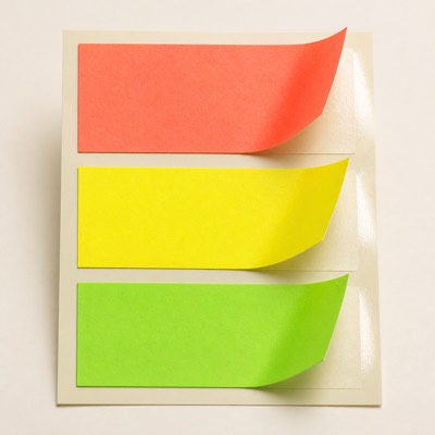
Fluorescent Paper
High-visibility fluoro face stock. For promotional flashes, price marks and warnings — anything that has to be seen before it is read.
Films & synthetics
Where moisture, oil, abrasion or a no-label look rule paper out.
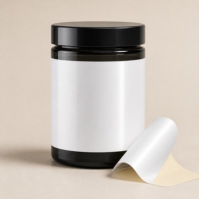
White BOPP
An opaque white polypropylene film. The workhorse film. Handles moisture, oils and squeezing without cracking the print, which paper will not.
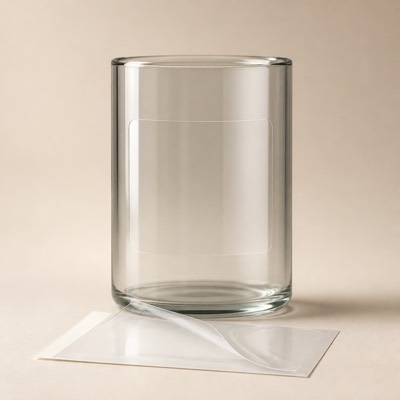
Clear BOPP
Transparent film for the no-label look. Needs white ink underprinted beneath the colours, or the artwork goes translucent against the product behind it.
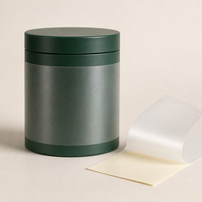
Matt BOPP
A non-reflective film face. Gives a film label a paper-like appearance while keeping the water and oil resistance paper does not have.
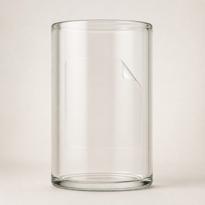
Clear PET
A stiffer, more dimensionally stable clear film. Preferred over BOPP where the label is large or the container is rigid glass, because it resists distortion during application.
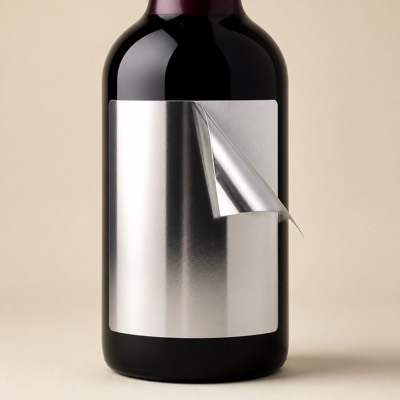
Metallised PET
A mirror-metallic film face. The PET silver used on our Jinshiyuan spirit label work — a metallic ground and a moisture barrier in one material.
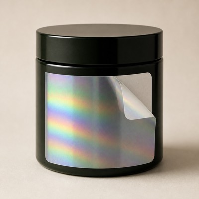
Holographic Film
Diffractive film, plain or registered to the artwork. Random-repeat film is decorative and anyone can buy it. Positioned holography is a security feature, because it has to be set up deliberately.
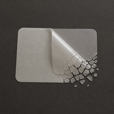
Destructible / Fragile
A face stock that breaks apart if lifted. Cannot be removed intact, which is the point. Used for warranty seals and tamper evidence.
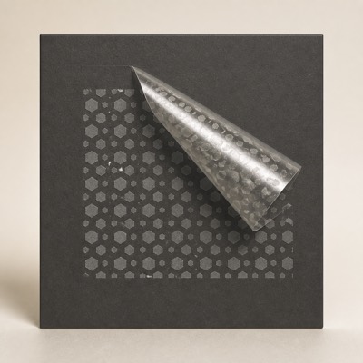
VOID Tamper-Evident
Leaves a VOID pattern behind when removed. Evidence stays on the container, not just the label, so a refilled pack cannot be passed off as sealed.
Adhesive systems
Chosen against the surface, the fill temperature and the conditions the pack will actually meet.
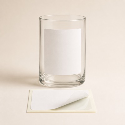
Permanent
The default bond, intended never to be removed. Reaches full strength over about 24 hours. Judge adhesion the next day, not the moment it is applied.
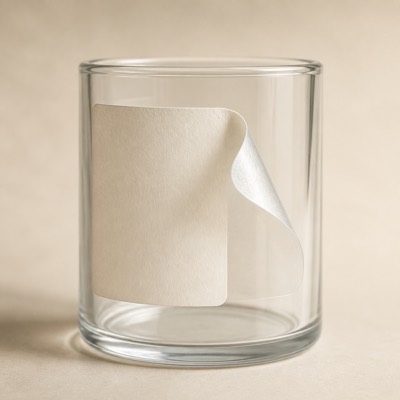
Removable
Peels away cleanly within its working life. For promotional flashes and anything that must come off in store without leaving residue on the primary pack.
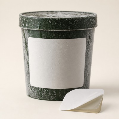
Freezer & Chilled
Formulated to bond at low temperature. A standard adhesive applied to a cold, damp container will not key. If the pack is labelled after chilling, say so at quoting.
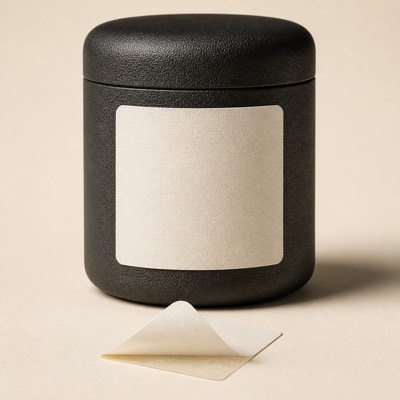
High-Tack
A stronger initial grab for difficult surfaces. For textured, curved or low-energy surfaces — recycled board, some plastics, tightly curved necks.
Non-woven
Not paper. Carried here because reusable bags are specified alongside the paper range.
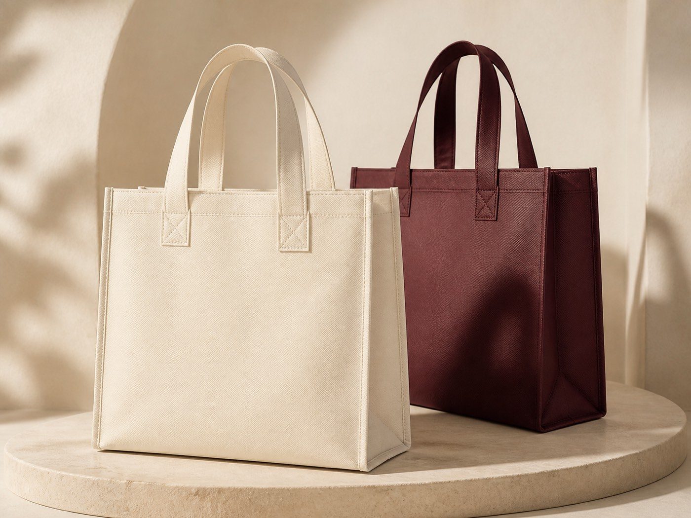
Non-Woven Polypropylene
The base fabric — light, tear-resistant and water-tolerant. Available in a wide range of stock colours, which is usually cheaper than printing a solid background.
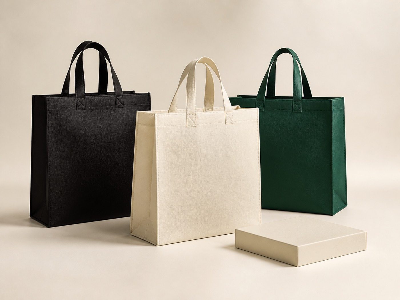
Laminated Non-Woven
A printed film bonded to the fabric face. The only route to photographic, edge-to-edge artwork on a non-woven bag. It also gives a wipe-clean surface.
Webbing & Self-Fabric Handles
Handles cut from the bag material, or stitched webbing. Self-fabric keeps the bag mono-material; webbing carries more weight. The choice follows the load, not the look.
How to choose
Two decisions do most of the work. The first is coating: a coated surface holds ink tightly, so photography and fine detail stay sharp, while an uncoated or textured surface absorbs it and reads softer — which flatters type and blind emboss but blunts an image.
The second is the colour of the substrate itself. Anything printed onto brown kraft, black board or a metallic ground is affected by what sits underneath it, because printing inks are largely translucent. That is why we proof on the actual stock rather than on white, and why a brand colour approved on one material is not automatically approved on another.
Every material below can be specified in FSC-certified or recycled-content grades where your materials policy requires it, printed with water-based inks and adhesives. Board thickness is quoted per project against the weight the pack carries and the opening feel you want, rather than sold as a fixed range.
Choosing between C1S and C2S
C1S is coated on the printing face only, and is the right default whenever the inside of the pack is not seen. Pay for C2S when the inner surface is part of the design — a printed inner lid, an unboxing reveal, or a sleeve visible from both sides.
When texture is worth it
Textured and felt-marked stocks carry a tactile identity with no extra finishing pass, which often costs less than achieving the same effect with lamination. The trade-off is print bite: keep photographic imagery off texture and let type, foil and blind emboss do the work.
Printing on dark and metallic stock
Inks are translucent, so a colour laid on black or metallic board shifts toward the ground beneath it. Opaque white can be printed underneath to restore density, and this is always proofed on the actual material before approval.
Sustainable specification
FSC-certified and recycled-content grades are available across these materials, with water-based inks and adhesives. Mono-material construction — paper board with paper fitments instead of foam — is usually the bigger win over swapping one board for another.