Packaging design, done by the people printing it
A studio designs to a template and hands you a PDF; the factory sends back a list of changes. Most packaging projects lose their time and budget in that loop. We do the work instead, because the file has to run on our presses in the end.
01 — Artwork check
You already have print-ready files from a designer or another supplier.
We open your files against the structure you have chosen and tell you what will run and what will not — bleed, separations, live type, foil and emboss on their own layers, minimum type size, whether the dieline matches the box you actually ordered. Most files we receive need something. Finding out now costs nothing; finding out after plates are made costs a reprint.
You receive
- Written check against our press requirements — A list of what needs changing, in the order it matters.
- Manufacturability opinion — Whether the structure as drawn can be made at your quantity and finish.
Not included
- We do not redraw the files at this tier
- No new structure is engineered
02 — Dieline & print-ready artwork
You have a logo and a look, but nothing a factory can print from.
This is where most packaging projects stall. A brand arrives with a logo and a reference photo, discovers a factory needs a dimensioned dieline with bleed, correct separations and outlined type, and leaves to find a designer who understands packaging. We would rather do that work than lose the project to it — and because we are the ones printing it, the file is drawn to our presses and our tolerances rather than to a general-purpose template.
You receive
- Dimensioned dieline — Drawn for the structure you chose, to the tolerances our machines hold.
- Print-ready artwork — Bleed, separations, outlined type, and foil, emboss and varnish on separate layers.
- Manufacturability review — What will run, what will not, and what it would cost to change.
- A bounded number of revision rounds — Stated before you commit, so the scope cannot drift.
Not included
- We are not inventing your brand at this tier — bring the logo and the colours
- No range-wide art direction or naming
03 — Full concept package
You are launching a range and want the whole thing designed as one system.
A concept package treats the range as one object rather than a set of separate boxes. It starts with a written direction — what the brand is claiming and to whom — and ends with files our presses can run. In between: a mark, a colour system that holds across coated board, uncoated card and film, packaging design applied to every structure in the range, dielines for each, and mockups showing how it looks on a shelf and in a hand.
You receive
- Written design direction — What the range is claiming, who it is for, and the reasoning behind the visual decisions.
- Brand mark and lockups — Including the small-space version that survives being printed 12 mm wide on a neck label.
- Colour system — Pantone references chosen so the colour holds across every substrate in the range, not just the first one.
- Packaging design across the range — Every structure designed as part of one system — outer carton, label, gift box, bag, printed components.
- Dimensioned dielines for each structure — Drawn to our presses, so the design cannot specify something we then cannot make.
- Mockups and renders — The range shown together, which is how a buyer or a retailer will actually see it.
- Print-ready files and a physical sample — The concept ends in something you can hold, not a PDF.
Not included
- Naming, tone-of-voice and campaign copywriting are quoted separately
- Photography of the finished product is a separate shoot
Why buy it from the factory
The file is drawn to the press that will run it
A studio designs to a template and hands you a PDF. We design to the machine that will print it, at the tolerances it actually holds, which is why our files do not come back with a list of changes from the factory.
Colour is decided on the real substrate
A brand colour approved on screen behaves differently on coated board, uncoated card and clear film. We proof on the material the job will run on, before the design is signed off rather than after.
One supplier, one approval trail
Design, dieline, sampling and production sit in one place, so a revision reaches every component at once instead of three vendors versioning independently.
The concept ends in a sample, not a slide
Every concept we sell is proven as a physical sample in 5–7 working days. A design that cannot be made is not a design, and that is discovered on our floor rather than in your production run.
Concept work — Anpér 安珀
A repair range that had to read as a medical device and a beauty product at once
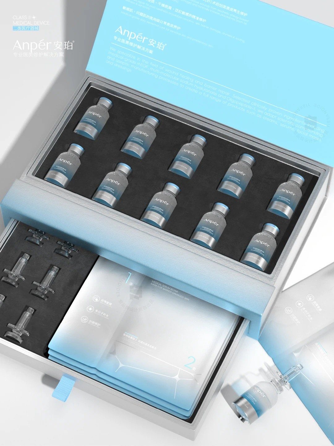
A Class II medical-device skincare line for post-procedure repair — rhEGF, multi-molecular sodium hyaluronate, Oligopeptide-1 — that had to feel clinically credible without the coldness that usually comes with it.
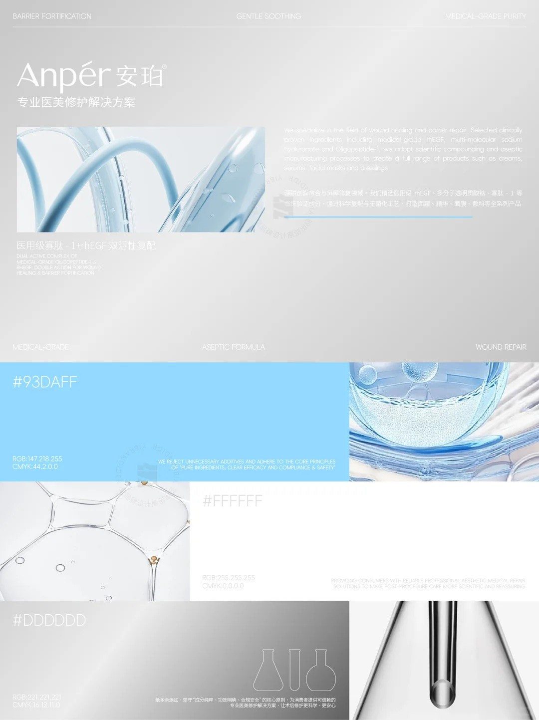
The range solves a positioning problem before a visual one. Post-procedure repair sits between a pharmacy and a beauty counter, and packaging that leans too far either way loses the other audience. The answer is a cell-molecule motif drawn as faint linework — structural enough to read as biotech across a clinic shelf, fine enough to read as ornament in the hand.
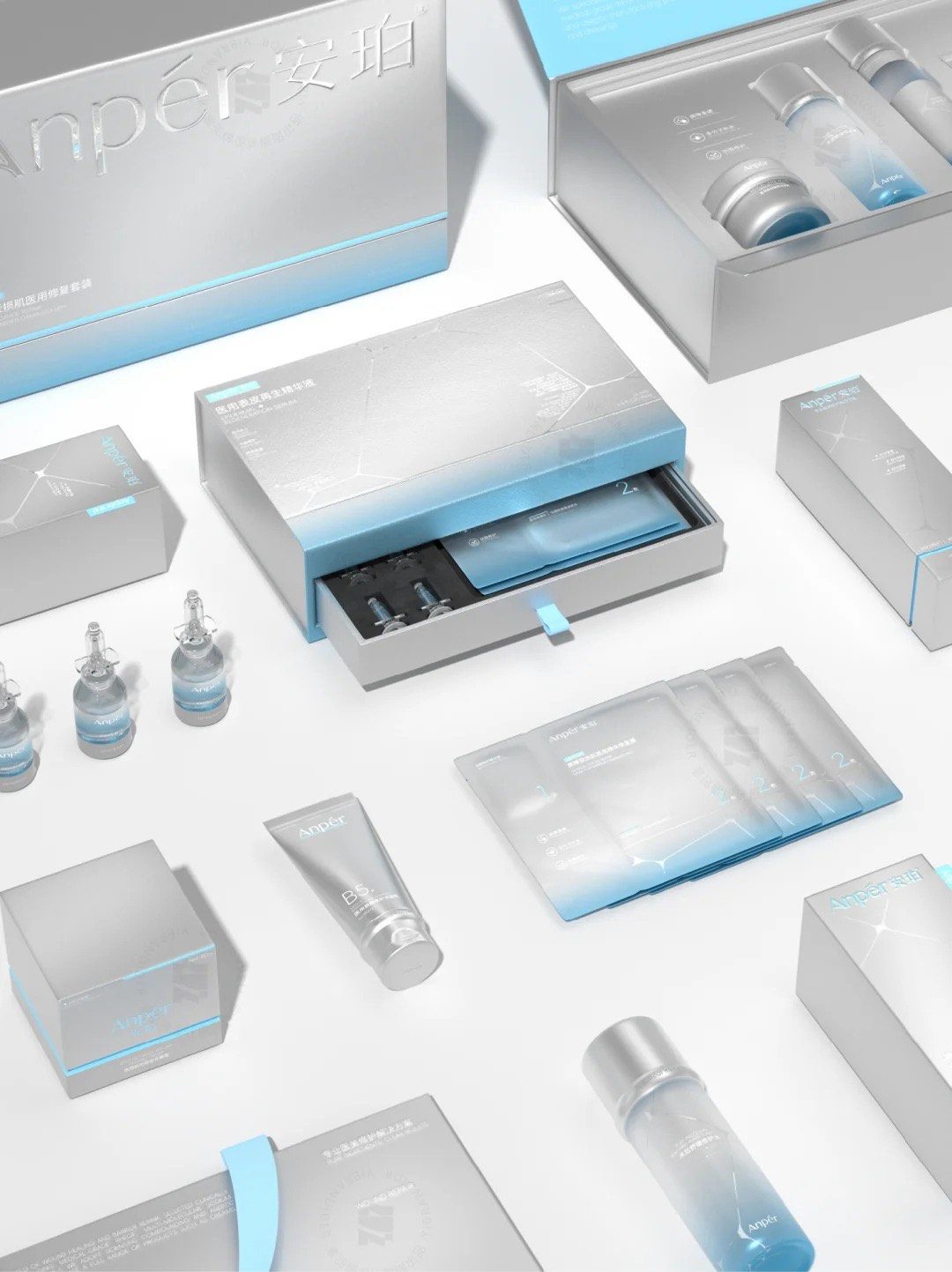
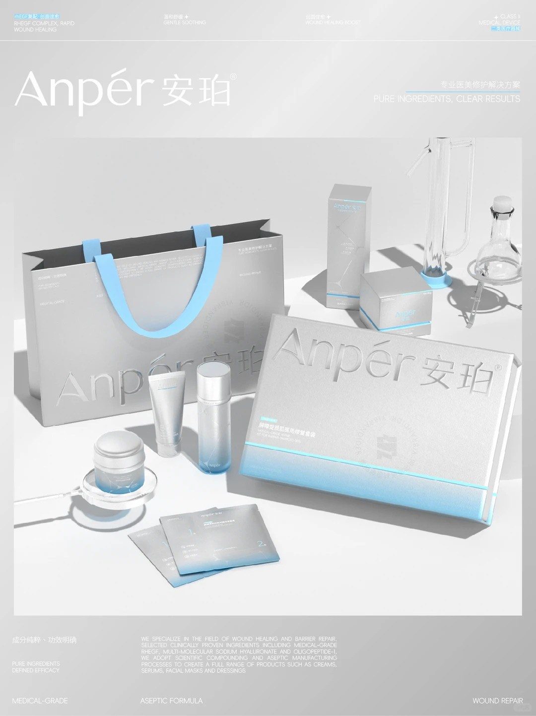
The colour system is three values and no more: #93DAFF, #FFFFFF and #DDDDDD. That restraint is what lets a silver-grey substrate carry a blue gradient without the pack looking like a hospital consumable. The gradient runs bottom-up on every component, so a 4.5 ml vial, a B5 tube and a carton read as one family at completely different scales.
Structurally the interesting piece is the drawer box: a rigid sleeve and tray with a die-cut foam insert holding ten glass vials in formation, a second tray beneath for masks and applicators, and a ribbon pull. It is a presentation problem and a protection problem at the same time — glass that must not move, in a box a clinic opens in front of a patient.
Everything else extends the same matrix: micro-embossing on the vial labels, an embossed pattern inside the gift box lining, and a carrier bag with a blue webbing handle drawn from the same three-value palette.
- Brand mark
- Colour system
- Vial, tube & carton design
- Drawer presentation box
- Foam insert engineering
- Carrier bag
- Renders


Design by 生意者品牌设计
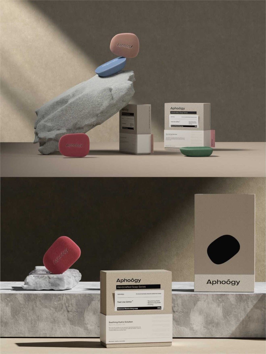
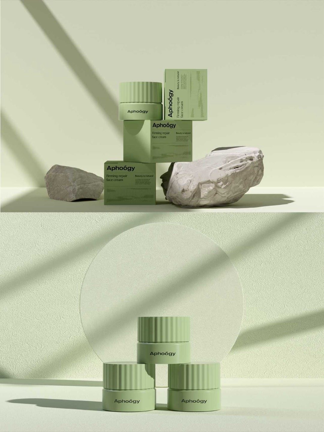
Concept work — Aphoógy
A botanical range where the soap is the logo
"Beauty is natural" — a handcrafted soap and skincare range that had to look botanical without reaching for the usual leaves and kraft paper.
The range solves its own identity problem: the soap is pressed into a soft, rounded pebble, and that silhouette becomes the brand mark. It is die-cut into the presentation carton, so the outer box shows the shape of what is inside without a window or a photograph.
Colour does the sorting. Each variant takes a muted tone — clay pink, dusty blue, sage, deep rose — against a taupe and cream board that reads as unbleached without actually being kraft. Type is set small and structured, closer to a specification sheet than a beauty label, which is what stops the botanical story tipping into softness.
Structurally it is two tuck-end cartons at different scales plus a larger presentation box, all sharing one grid so the range stacks and merchandises as a set.
- Brand mark
- Colour system
- Soap & carton design
- Die-cut presentation box
- Dielines
- Renders
Design by ReBeauty 星意 Design
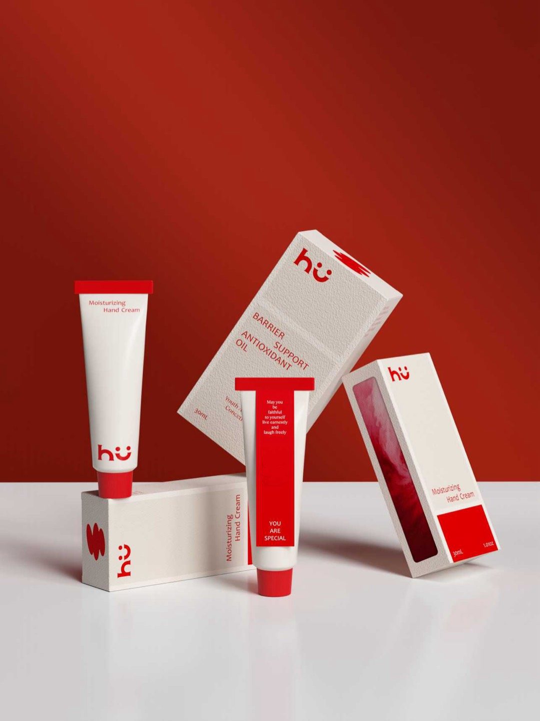
Concept work — hü
Two colours, a smile, and nothing else
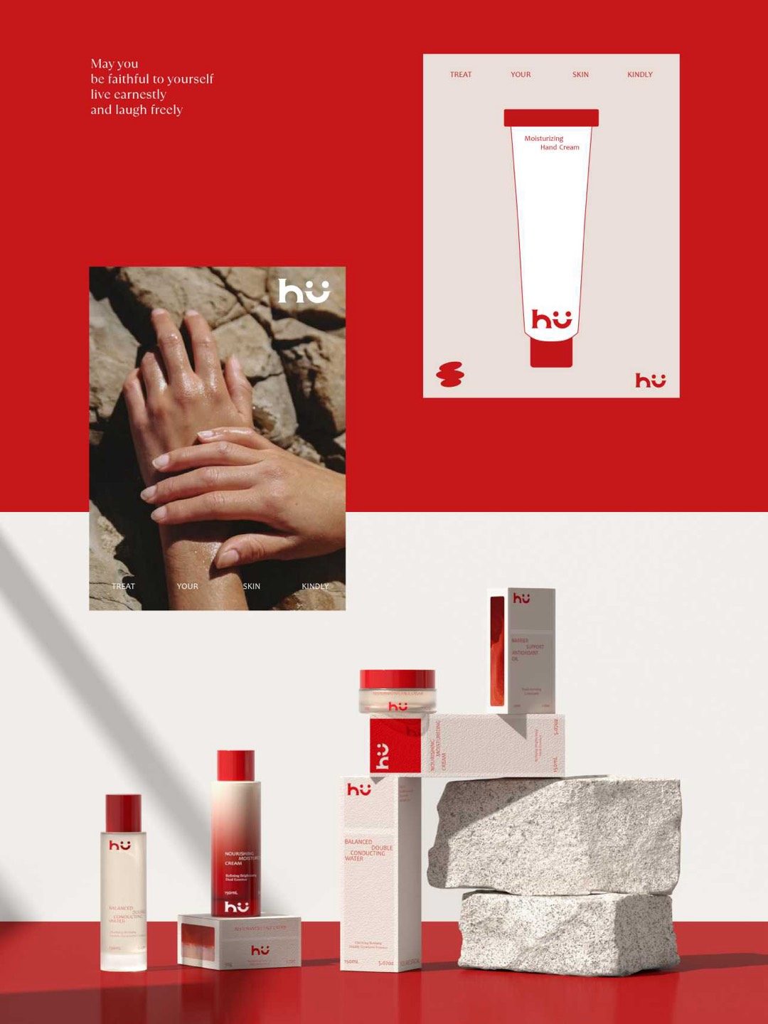
"Treat your skin kindly" — a barrier-care range for people who are tired of clinical packaging telling them what is wrong with their face.
The mark is a two-dot smile inside the ü. It carries the entire tone of voice, which means the packaging can otherwise be almost empty — and it is: one red, one white, a textured uncoated board, and copy that reads like a note rather than a claim.
The range runs across a hand cream tube, an antioxidant oil, a moisturising cream and a conducting water, so the system had to survive very different shapes. It does it by keeping the red as a block rather than a pattern: a full panel, a gradient window, a cap, a single brushstroke.
The window carton is the most technical piece — a die-cut aperture backed with a red gradient so the pack reads as full even before the product is in it.
- Brand mark
- Range architecture
- Tube & carton design
- Window carton
- Dielines
- Poster & renders
Design by ReBeauty 星意 Design
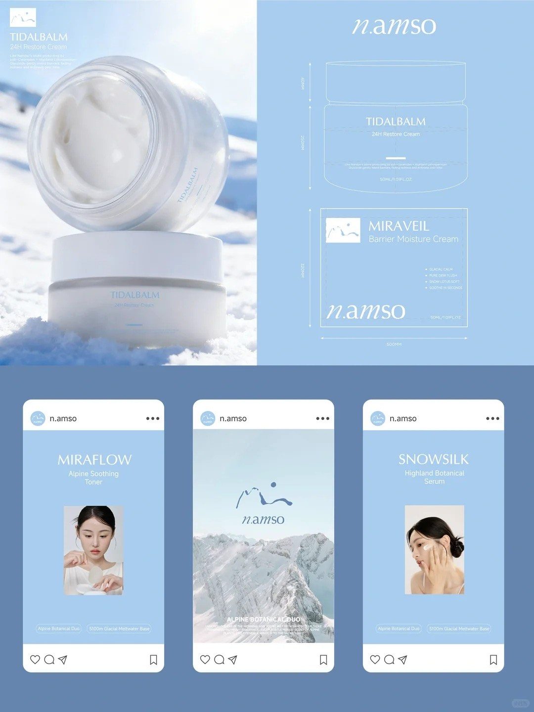
Concept work — n.amso
A sensitive-skincare range built on a sacred lake
"We want a skincare brand for sensitive skin, with the soul of a sacred snowy mountain and holy lake. It must be pure and healing for the modern woman."
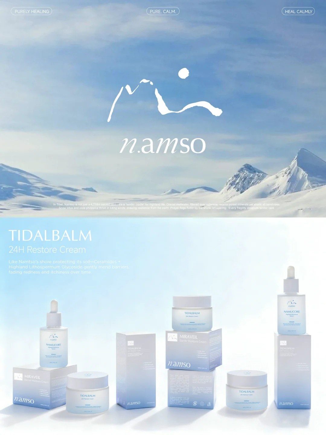
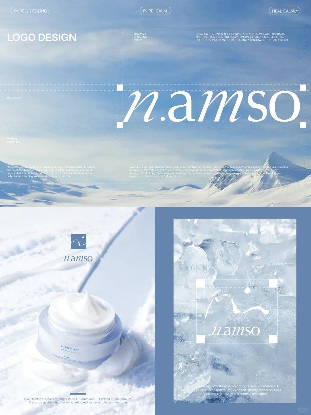
The concept takes Namtso — a lake at 4,718 m in Tibet — as its whole visual argument: glacial meltwater filtered over millennia, snow lotus and viola philippica surviving in thin air, a place that is harsh and gentle at once. That reading decides everything downstream, which is what a concept package is for.
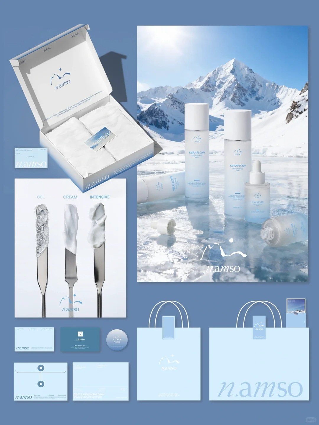
The mark is drawn in rough brushstrokes — a snow peak and a sun — and paired with a wordmark that sits between handwriting and a stable serif. It is built to survive being printed small: the same lockup works across a 50 ml jar lid, a neck label and a carrier bag.
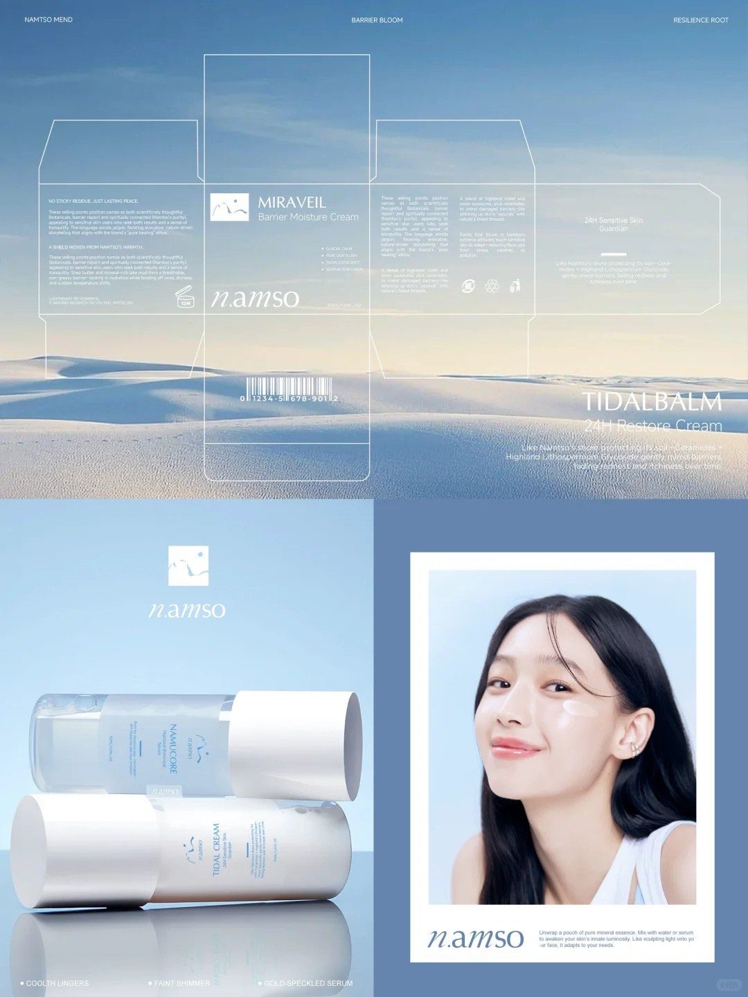
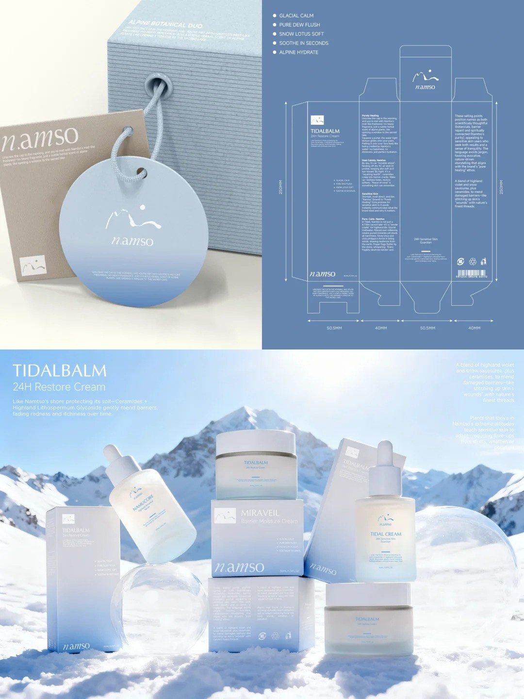
The colour system runs a blue-to-white gradient — sky, lake, glacial cloud — specified so it holds on coated carton, uncoated card and frosted glass rather than only in the original file. Packaging design then covers the whole range together: toner, serum, two creams, their outer cartons, hang tags, mailer, stationery and social templates.
Every structure ships with a dimensioned dieline. That is the part most brands do not realise they are missing until a factory asks for it — and the reason a concept package ends at a file a press can run, not a presentation.
- Brand mark
- Colour system
- Packaging design across 5 SKUs
- Dimensioned dielines
- Mockups & renders
- Social & stationery
Design by ReBeauty 星意 Design
Concept work — SOLSOL
Hang tags carrying a whole apparel brand
"We don't follow, we filter" — a womenswear label whose packaging budget is essentially the hang tag.
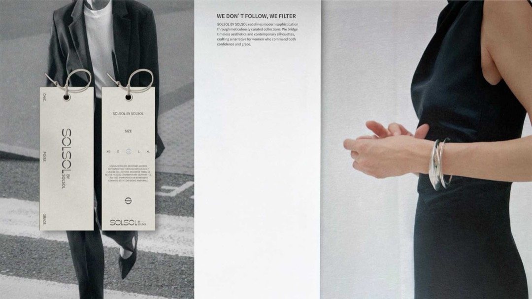
Apparel packaging is often one printed component doing the work of an entire identity, and this is that case. The tag is long and narrow, set vertically, with the logotype rotated so it reads up the length — a proportion that only works because the board is heavy enough to stay flat on the rail.
The pair splits duties: one face carries the positioning line, the other the size scale and the care copy. A metal eyelet and a wire loop replace the usual cotton string, which is a small cost difference that reads as a large quality one at the moment a customer picks the garment up.
- Logotype
- Hang tag design
- Size & care system
- Eyelet & hardware spec
- Dielines
Design by ReBeauty 星意 Design
Concept work shown here may be the property of the studio or brand credited. If you own work on this page and would like it removed, email us and we will take it down. info@yuanpackaging.com
Design is quoted on scope, with the number of revision rounds agreed before you commit.