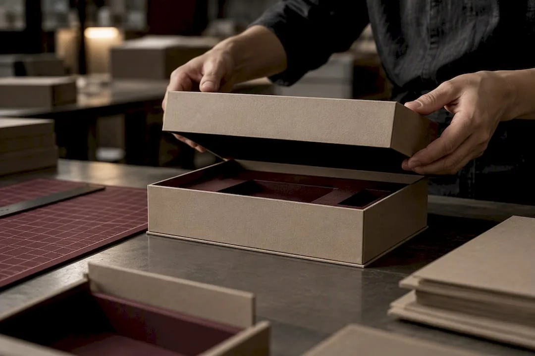
Great skincare box design does four things at once: it signals the brand’s positioning the instant a customer sees it, protects a jar or pump through shipping, turns unboxing into a moment worth photographing, and comes apart cleanly for recycling. Start by matching box type to product fragility, specify one or two finishes that reinforce (not fight) your brand tone, confirm the structure can be fully emptied and sorted, and build a physical prototype before you commit to a production run. Experienced packaging manufacturers have guided brands through similar sequences for many years — the production checklist below walks through each decision.
TL;DR: Rigid boxes are ideal for high-end skincare products priced above $40, offering a premium feel, while folding cartons are suitable for everyday products to reduce costs. Finishes like foil stamping, embossing, and soft-touch lamination convey luxury quality, but layers such as foil and spot UV require tight registration to avoid production errors. Designing for sustainability focuses on reducing material usage, choosing recyclable materials, and ensuring easy detachment of components like closures for better recycling efficiency. The dieline must be built around actual product dimensions, with separate files for each finish layer, and validated through multiple sampling stages before mass production. Primary packaging is the actual product container, while secondary packaging functions as protection and branding, with design choices affecting both sustainability messaging and consumer perception.
Table of Contents
- Choosing the Right Box Type and Material for Skincare Boxes
- Finishes and Tactile Details That Signal Premium Quality
- Designing Skincare Boxes for Reuse and Recycling
- The Production-Ready Dieline: What to Prepare Before Mass Production
- Digital Mockups and Tools for Faster Skincare Packaging Validation
- Yuan Packaging Credentials and Questions to Ask Your Supplier
- Primary vs. Secondary Packaging: What Each One Actually Has to Do
- Regulatory and Labeling Rules Every Skincare Box Has to Meet
- Trends Shaping Skincare Box Design and What Consumers Actually Prefer
- Weaving Brand Identity Into Skincare Box Design
- What Most Skincare Brands Get Backwards About Box Design
- Ready to Prototype Your Skincare Box? Start Here
- Where to Go Deeper on Skincare Packaging Rules
- Sources
- FAQ
Choosing the Right Box Type and Material for Skincare Boxes
The product inside should decide the structure around it, not the other way around. A heavy glass jar of night cream behaves nothing like a lightweight serum tube, and specifying the wrong board for either one shows up as crushed corners or a wobbly lid within the first shipping cycle.
Rigid boxes earn their premium price when the product is meant to feel like a keepsake. Thick chipboard wrapped in printed paper or fabric gives a satisfying weight and a “shelf-worthy” hand feel that folding cartons can’t fake. They suit high-end serums, gift sets, and anything positioned above $40 retail. Folding cartons (SBS or coated board, typically 300 to 400 GSM) work for everyday moisturizers and cleansers where cost-per-unit and shipping weight matter more than keepsake appeal. Corrugated shippers belong outside the retail box entirely, as protective outer packaging for e-commerce fulfillment, not as the consumer-facing container.
A few structural rules apply across all three:
- Match insert cavities to the exact footprint of jars, pumps, or tubes. A loose product rattles and scuffs in transit.
- Specify board caliper by weight: light serum boxes can run 24pt, while jar-holding rigid boxes often need 1,700 GSM wrap-board or heavier for edge rigidity.
- Consider printability before locking in material. Uncoated recycled board takes soft-touch coatings beautifully but mutes bright spot colors more than coated stock does.
Pro Tip: Order structural samples in the actual board weight you plan to use, not a proxy stock. Perceived rigidity changes dramatically between a 20pt and 24pt caliper, and that difference is invisible in a digital render.
Finishes and Tactile Details That Signal Premium Quality
The finish is where a skincare box either earns its shelf price or gives itself away as generic. Each technique carries a distinct cost and a distinct message, so pick based on brand tone rather than trend alone.
- Foil stamping adds metallic accents to logos or key type. Best for brands leaning into luxury or heritage cues.
- Embossing raises a texture or logo off the surface, giving a tactile cue you feel before you read.
- Spot UV adds selective gloss over matte board, useful for highlighting an icon or ingredient callout without full foil cost.
- Soft-touch lamination gives that velvet-like hand feel consumers associate with clean beauty and minimalist brands.
Research on multisensory packaging backs up what good designers already sense intuitively: tactile and visual features like texture, closures, and compact size materially affect how attractive shoppers find cosmetic packaging, and can measurably reduce return rates. The same study found textured surfaces, magnetic closures, and electroplated accents scored particularly well, while oversized boxes hurt perceived value rather than helping it.
Closures matter as much as surface texture. A magnetic-close rigid lid feels expensive and reusable; a simple tuck-top folding carton feels efficient and everyday. Neither is wrong, but mismatching closure to price point undercuts the whole design.
On the production side, every added finish layer introduces registration risk. Foil and emboss need tight tolerances to align with printed artwork, and stacking spot UV over foil multiplies both cost and the chance of misregistration on long runs.

Designing Skincare Boxes for Reuse and Recycling
Sustainability in skincare box design starts with restraint, not certification badges. Circular packaging guidance from FH Campus Wien puts reduction and reuse ahead of recycling in the hierarchy: the most sustainable box is the one that uses fewer materials in the first place, then gets designed so what remains can actually be recycled.
That means a few concrete habits:
- Stick to one primary material per box wherever possible. A rigid box wrapped in plastic-laminated paper is harder to sort than one wrapped in uncoated stock.
- Design closures and inserts to detach easily or stay attached through the recycling stream, since loose small parts routinely get rejected at sorting facilities.
- Check local recovery systems before specifying plastic components. The same guidance notes that Austria can fully reprocess PET for food-contact packaging while some regions restrict recycled PP from similar use, so a structure that recycles cleanly in one market can stall in another.
Material choice also shapes what customers are willing to pay. A 2025 study on sustainable packaging elements found glass and bio-based materials scored highest for willingness to pay, with clear labeling and refill options adding measurable value on top. Skip vague “eco-friendly” claims on the panel; a QR code linking to real material data avoids greenwashing accusations and gives sourcing-conscious buyers something to verify.
Pro Tip: Design your secondary box to double as a travel case or storage box. A durable rigid structure that survives a second life reduces the “single-use gift box” problem entirely, and shoppers notice the intent.
The Production-Ready Dieline: What to Prepare Before Mass Production
A beautiful render means nothing if the dieline doesn’t account for real-world tolerances. Skincare boxes fail in production more often from insert mismatches and glue-panel errors than from bad artwork.
- Build the dieline around the product, not the concept. Confirm bleed, safe zones, fold lines, and glue panels against the actual jar, pump, or tube dimensions, including insert tolerance of a millimeter or two for manufacturing variance.
- Separate artwork by finish layer. Foil, emboss, and spot UV each need their own vector file, distinct from CMYK print files. Mixing spot colors into a CMYK build is a common cause of color drift between proof and production run.
- Follow the three-stage sampling sequence. A structural sample (blank, unprinted) confirms fit and fold integrity. A print and finish proof confirms color accuracy, foil placement, and coating consistency. A production sample, pulled from the actual run, confirms the first two hold up at scale.
- Inspect closure function at every stage, not just at the final sample. A magnetic closure that aligns on a hand-cut prototype can shift once cutting dies run at volume.
Pro Tip: Request the structural sample before finalizing any print files. Structural problems caught at the blank stage cost nothing; the same problems caught after a full print run cost the entire batch.
Digital Mockups and Tools for Faster Skincare Packaging Validation
Digital mockups earn their place by catching problems before a single sheet of board gets cut. A photoreal 3D render tells you how a design reads on an e-commerce thumbnail and whether your logo survives being shrunk to a 200-pixel-wide product image. It does not tell you how the lid feels, how heavy the box is, or whether the magnetic closure actually holds. That gap is why mockups and physical samples serve different jobs, not competing ones.
Commercial mockup platforms generally follow a similar workflow: choose a template close to your dieline shape, upload flat artwork, and export a photoreal render suitable for internal review or marketing use ahead of physical samples. Use these renders to stress-test the design across your full SKU range at once, checking that a five-piece skincare line reads consistently at shelf distance and at thumbnail size.
Before moving to physical samples, request from your manufacturer:
- A dieline PDF matched to your exact product dimensions
- Physical finish swatches (foil colors, soft-touch stock, spot UV samples)
- A photo proof of a comparable finished box, not just a render
Yuan Packaging Credentials and Questions to Ask Your Supplier
Choosing a manufacturer for skincare boxes comes down to a handful of concrete questions, and the answers separate a reliable production partner from a risky one.
Some packaging manufacturers have delivered millions of packaging units to thousands of brands worldwide over many years, working across rigid boxes, folding cartons, and specialty finishing including foil stamping, embossing, and spot UV. That kind of volume matters less as a headline number and more as evidence of consistency across repeat runs, which is what a growing skincare brand actually needs.
Before signing with any supplier, ask:
- Which finishes can they execute in-house versus outsource, and what’s the registration tolerance on foil and emboss?
- Can they provide FSC-certified board options, and what documentation backs the certification?
- What’s the minimum order quantity, and does it scale down for a first production run?
- What’s the sample lead time from approved dieline to physical proof in hand?
A production quote is only as useful as the documents behind it. Ask for the dieline PDF, the finish swatch set, and a sample timeline in writing before comparing price across suppliers. A low bid that skips proofing steps costs more once errors surface at scale.
Yuan Packaging’s cosmetics and beauty packaging work spans exactly these finish types, built around the compliance and sourcing standards global skincare brands expect.
Primary vs. Secondary Packaging: What Each One Actually Has to Do
Primary packaging touches the product directly: the jar, tube, bottle, or pump that holds the cream or serum itself. Secondary packaging is the box around it, and its job is entirely different. Primary packaging has to be chemically compatible with the formula, resist leaks, and often carry dispensing mechanics like an airless pump. Secondary packaging has to protect that primary container in transit, communicate the brand at shelf, and often carry the regulatory label information that doesn’t fit on a small jar.

Conflating the two leads to design mistakes. A designer who treats the outer box as the only branding surface can end up with a jar that looks generic once unboxed, since the box gets recycled or discarded within days while the jar sits on a bathroom counter for months. The stronger approach treats both surfaces as branding opportunities with different jobs: bold, story-driven graphics on the box that gets seen once at purchase, and clean, durable branding on the jar that gets seen daily.
Secondary packaging also carries more design freedom for sustainability messaging, since it’s discarded sooner and doesn’t need to survive months of bathroom humidity. That’s where QR codes, refill program details, and recycling instructions belong, keeping the primary container’s surface reserved for ingredient lists and usage direction that need to stay legible for the product’s full life.
Regulatory and Labeling Rules Every Skincare Box Has to Meet
Skincare packaging isn’t just a branding surface. It’s a regulatory document, and labeling requirements vary meaningfully by market even though the core categories of information stay similar worldwide.
Most jurisdictions require an ingredient list, typically in descending order of concentration, along with net weight or volume, a manufacturer or responsible-party name and address, and a batch or lot code for traceability. Many markets also require a period-after-opening symbol, an open-jar icon with a number indicating how many months the product stays safe to use once opened, and specific warning language for actives like retinoids or exfoliating acids.
Designers need to build label real estate into the dieline from the start, not add it as an afterthought once the hero graphic is locked. A common mistake is designing a beautiful minimalist panel, then discovering during compliance review that mandatory ingredient text won’t fit at a legible font size. Reserve a dedicated, flat panel for regulatory copy early in the layout process, and treat that space as fixed rather than negotiable.
Anti-counterfeit measures deserve consideration too, particularly for higher-price skincare lines vulnerable to gray-market copies. Holographic elements, serialized codes, or tamper-evident seals can be built into the box structure itself rather than added as a separate sticker, preserving the clean look while adding a verification layer that protects both the brand and the buyer.
Trends Shaping Skincare Box Design and What Consumers Actually Prefer
Consumer preference in skincare packaging has moved away from the maximalist, ingredient-list-on-the-front approach that dominated a few years back. A 2025 case summary of a packaging refresh in organic beauty found that switching to FSC-certified uncoated carton board, paired with a larger logo and clearer front-of-pack benefit callouts, improved shelf standout and premium perception, a signal that restraint paired with confidence reads better than crowded copy.
Compact box dimensions are trending upward in preference too. Oversized packaging that once signaled luxury now reads as wasteful to a growing share of shoppers, particularly younger buyers who associate excess packaging with poor sustainability practice. A tightly sized box with a textured finish outperforms an oversized one with the same graphics, according to multisensory attractiveness research cited earlier.
Color palettes have shifted toward muted, earth-toned schemes, sage greens, warm browns, unbleached kraft tones, partly because these read as sustainable and partly because they photograph well for social unboxing content. Simplicity works to a brand’s advantage here: a limited palette combined with a strong tactile finish tends to outperform busy graphics for premium skincare audiences, since the texture itself becomes the visual interest.
Refillable and reusable secondary packaging is also gaining traction, with rigid boxes increasingly designed to double as a travel case rather than get discarded after first use.
Weaving Brand Identity Into Skincare Box Design
A skincare box only works as branding if every design decision traces back to a consistent visual identity, not a collection of trend-driven choices layered on top of each other. Typography, color, finish, and structure all need to say the same thing about the brand, whether that’s clinical precision, botanical warmth, or minimalist luxury.
Typography carries more brand weight on skincare packaging than most designers give it credit for. A clean sans-serif signals clinical, dermatology-adjacent positioning. A softer serif or hand-lettered logo signals warmth and natural ingredients. Mixing the two within one product line confuses the shelf story, even when each individual box looks fine on its own.
Color consistency across a product range matters more than any single color choice. A five-SKU serum line with five unrelated color schemes reads as five different brands rather than one cohesive collection, undermining the shelf presence a unified line could otherwise command. Structural choices reinforce identity too: a brand built on precision and minimalism should carry that through consistent box proportions across every SKU, not just a shared logo placement.
The finish itself becomes part of brand vocabulary once it’s applied consistently. A brand that always pairs soft-touch lamination with a single foil accent color builds recognition over time, the same way a signature scent or bottle shape does. Consumers start to recognize the brand by hand feel before they read the label, which is precisely the multisensory effect the tactile-attractiveness research describes.
What Most Skincare Brands Get Backwards About Box Design
Most brands treat packaging design as a creative decision made first and a production problem solved later. That order is exactly backwards, and it’s why so many skincare launches get delayed by weeks over a dieline mismatch nobody caught until the print run was already scheduled.
The conventional advice tells designers to chase trends: muted palettes, textured soft-touch stock, minimalist typography. That advice isn’t wrong, but it’s incomplete. A gorgeous render means nothing if the insert doesn’t fit the jar or the closure fails after three transit cycles. The brands that consistently ship on time treat structural soundness and finish selection as one integrated decision, made with a manufacturer at the table from the concept stage, not after the “creative” is locked.
The other blind spot is sustainability theater. Slapping a green color palette on a box does more for perception than a genuine material change does for the planet, and consumers researching willingness to pay can tell the difference between real material substitution and a color choice dressed up as an eco-claim. If the board isn’t FSC-certified and the structure isn’t actually recyclable, a QR code linking to real sourcing data will earn more trust than another leaf icon ever will.
Prioritize the structural sample first, the finish second, and the sustainability claim only once it’s true. Everything else is decoration on top of that order.
— Anthony
Ready to Prototype Your Skincare Box? Start Here
Some packaging manufacturers can turn a skincare box concept into a physical sample efficiently by managing dieline review, finish sampling, and structural proofing within a coordinated production process rather than through separate vendors. That matters most in the exact moment this article has walked through: catching insert-fit and closure problems before they turn into a failed production run.
If you’re ready to move from concept to material, request a structural sample or explore rigid gift box options built around your product dimensions, finish preferences, and target sustainability standard. For brands also managing bottle or jar labeling, Yuan Packaging’s cosmetic and beauty label printing covers the primary packaging side of the same project. Start by sending your product dimensions and target finish list to get a dieline drafted for your next prototype.
Where to Go Deeper on Skincare Packaging Rules
For emptiability and material-sorting rules, consult the Circular Packaging Design Guideline. For tactile and visual research behind closures and texture, see the multisensory packaging attractiveness study. For practical sustainable packaging steps, see this partner guide on sustainable packaging design.
Sources
- Circular Packaging Design Guideline (FH Campus Wien)
- Study on sustainable packaging elements and consumer willingness to pay (2025) — MDPI Sustainability
- Exploring the multisensory attractiveness of cosmetic packaging (MDPI Sustainability)
FAQ
How Do I Choose Between Rigid Boxes and Folding Cartons?
Choose rigid boxes when the product is priced as a keepsake or gift, since the thicker board and premium hand feel justify the higher cost. Folding cartons suit everyday skincare items where shipping weight and per-unit cost matter more than keepsake appeal.
Does a Premium Finish Hurt Recyclability?
It depends on the finish. Foil stamping and lamination can complicate recycling if they’re not compatible with local sorting systems, while embossing and spot UV on uncoated board generally stay recyclable, according to circular packaging design guidance.
How Long Does Skincare Box Prototyping Usually Take?
Timelines vary by manufacturer and finish complexity, but the structural sample, print and finish proof, and production sample generally happen in sequence over several weeks rather than all at once. Building in time for each stage prevents rushed approvals that cause errors at full production volume.
What Information Legally Has to Appear on a Skincare Box?
Most markets require an ingredient list, net weight or volume, manufacturer information, and a batch code, along with a period-after-opening symbol for many product types. Requirements vary by jurisdiction, so confirm specifics for your target market before finalizing the label panel.
Can Yuan Packaging Provide FSC-Certified Board for Skincare Boxes?
Yuan Packaging offers sustainable and FSC-certified material options as part of its custom rigid box and carton production. Contact the rigid gift box team directly for certification documentation and current material options.