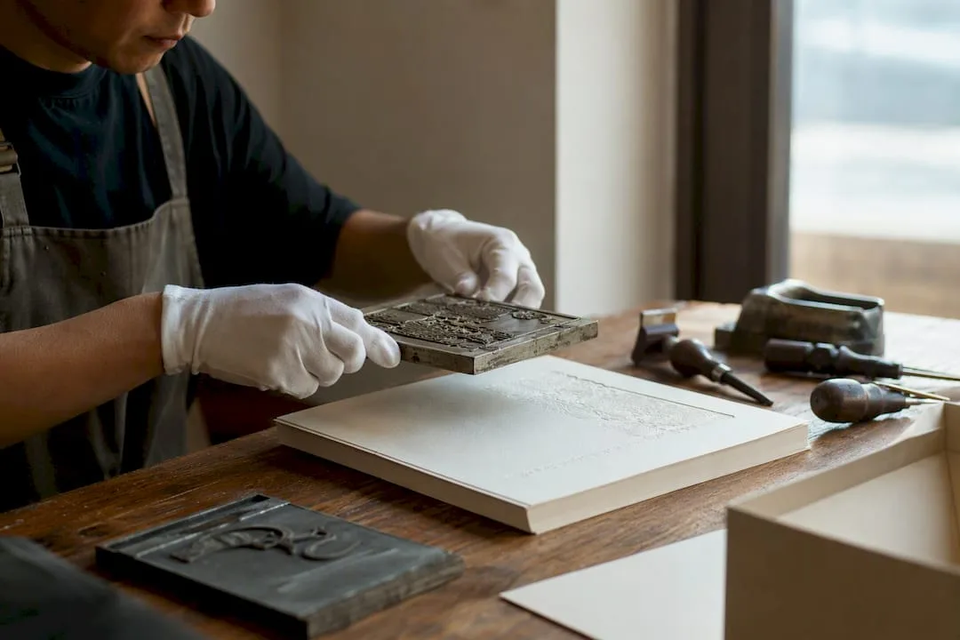
Embossing raises a design from the surface; debossing presses it in. Both rely on custom metal dies, heat, and pressure to permanently reshape the substrate’s fibers.
- Embossing pushes material upward for maximum visual and tactile pop.
- Debossing pushes material downward, keeping the reverse side flatter.
- Pick embossing when you want a logo or seal to command attention at the shelf.
- Pick debossing when the back of the sheet, or the inside of a box, has to stay smooth.
Emboss vs deboss at a glance
| Feature | Embossing | Debossing |
|---|---|---|
| Direction | Raised above the surface | Pressed below the surface |
| How it is made | A matched pair of dies: a female die with the design recessed and a male counter-die that pushes the sheet up into it | The same matched die and counter-die, with their roles reversed so the design is pressed down into the face; on thick board or leather a single die against a flat base can also be used |
| Best substrates | Stock that stretches without cracking, such as solid bleached (SBS) carton board, heavier text and cover weights, and uncoated, cotton or long-fiber papers; thin coated stock tends to crack | A wider range: the same stocks and mid-weight papers, plus thicker, denser materials such as heavy board, wrapped rigid-box board and leather |
| Pairing with foil | Foil embossing: a combination die foils and raises the design in one pass, or the foil goes on first and the emboss is registered to it | Foil debossing: a heated die presses the foil into the sheet in one pass, leaving the foiled design recessed |
| Reverse side | Shows a hollow mirror image of the design | Stays flatter, especially on thick board; on thin stock or with a deep impression the design can push through as a slight raised image |
| Typical uses | Logos, crests and seals on cartons, labels and covers | Rigid box lids, book covers, leather goods, and packs whose inside must stay smooth |
Key Takeaways
Embossing raises a design for maximum shelf presence, while debossing recesses it to keep the reverse side flatter and better suited to sensitive packaging interiors.
| Point | Details |
|---|---|
| Direction defines the choice | Embossing raises material; debossing presses it down, and that alone drives most decisions. |
| Reverse side matters | Debossing keeps the back flatter, which is critical for pharma, beauty, and lined interiors. |
| Stock weight is non-negotiable | Deep impressions need heavier cover stock or cotton fiber papers to avoid tearing. |
| Sequencing avoids costly errors | Embossing goes last in finishing; combining it with foil requires exact registration. |
| Yuan Packaging handles tooling in-house | Yuanpackaging pairs die production with quality control for rigid boxes, cartons, and labels used by premium brands. |
Table of Contents
- How Embossing Works: Dies, Depth, and Stock Choices
- When Debossing Is the Smarter Choice
- Embossing vs Debossing: A Side-by-Side Decision Guide
- What Drives the Cost of Embossing and Debossing
- Getting Predictable Results: Artwork, Depth, and Stock Limits
- Combining Finishes: Foil, Blind Embossing, and What Won’t Work Together
- What to Send Your Supplier Before You Order
- How Yuan Packaging Applies These Finishes to Premium Packaging
- Why the “Which Looks Better” Question Misses the Point
- Getting Your Embossing or Debossing Project Into Production
- Sources
How Embossing Works: Dies, Depth, and Stock Choices
Embossing uses two matching dies, a male die below and a female die above, that clamp the substrate between them under heat and pressure to force it upward into relief. Die material determines both cost and lifespan. Magnesium dies are cheap and fine for short runs, while copper and brass dies cost more but survive far longer production cycles.
- Single-level dies create a flat, uniform raised area, ideal for simple logos or wordmarks.
- Sculptured (multi-level) dies carve nuanced bas-relief, letting a single emboss show multiple depths and contours.
- Deep, crisp emboss needs thicker cover stock or cotton and long-fiber papers that stretch without tearing.
- Embossing usually happens last in the finishing sequence, after foil or print, since registering ink to an already-raised surface is far harder than the reverse.
Pro Tip: If you want registered foil inside an embossed shape, tell your supplier during quoting, not after proofing. Combination stamping changes die tooling and setup cost.
When Debossing Is the Smarter Choice

Debossing reverses the die orientation so the design presses downward, leaving a recessed impression instead of a raised one. The visual result reads as quieter and more understated than embossing, which is exactly why brands reach for it on projects where subtlety matters more than shine.
The bigger practical reason to choose debossing, though, is what happens on the other side of the sheet. Because the die presses from the front, the reverse side stays relatively flat, without the hollow mirror image that embossing leaves behind. That matters enormously in categories where the interior of a package or the reverse of a label has to look clean.
- Rigid box interiors and folding cartons, where show-through on the inside would look unfinished.
- Leather goods and accessories, where a flat back is often glued to a lining.
- Pharmaceutical and beauty packaging, where a smooth reverse reduces show-through around printed compliance text.
- Book covers and journals, where debossed type reads as premium without disrupting the spine or endpapers.
Debossing pairs well with ink fills or foil for added contrast, and it tends to tolerate a slightly broader range of stock weights than deep embossing does.
Embossing vs Debossing: A Side-by-Side Decision Guide
The two techniques share tooling and process but diverge on nearly every practical axis that matters to a buyer.
| Factor | Embossing | Debossing |
|---|---|---|
| Visual effect | Raised, three-dimensional | Recessed, understated |
| Tactile impact | Strong, immediately noticeable | Subtler, felt more than seen |
| Reverse-side impact | Visible hollow or shadow on the back | Stays relatively flat |
| Best stock | Thick cover stock, cotton, long-fiber papers | Slightly wider range, including mid-weight stocks |
| Cost/setup | Die cost scales with depth and detail | Similar die cost, often easier registration |
| Common applications | Logos, seals, luxury covers, foil combos | Box interiors, leather goods, pharma/beauty labels |
Choose embossing when the goal is shelf presence, a logo that catches light and fingers alike. Choose debossing when the reverse side has to stay clean or when the brand wants restraint over spectacle. Combining both on one piece is possible, embossing a logo while debossing a border, for instance, but it demands a specialized multi-level die and premium stock at 130lb or heavier to avoid paper failure.
What Drives the Cost of Embossing and Debossing
Embossing and debossing are priced the same way: a die charge plus press time. Ask for the die as a separate line on the quote so you can compare suppliers like for like. These factors move the total:
- Die making. Sculptured (multi-level) and combination foil-and-emboss dies are usually engraved in brass and cost more than a single-level magnesium or copper die.
- Die size. Die cost scales with the area of the design, so a full-panel pattern costs more than a small logo.
- Registration with print or foil. A blind impression on an unprinted area is the simplest set-up. Aligning the die to printed artwork or foil takes longer make-ready and a physical proof, and a separate foil pass adds a second press run.
- Sheet size and layout. More cartons or labels per press sheet means more die images and a higher die charge, but fewer sheets through the press; the longer the run, the more the press-time saving outweighs the extra die cost.
Volume changes the math too. Die setup is a one-time cost, so per-piece finishing expense drops as order volume climbs, which is why embossing and debossing show up more often on mid-to-large runs than on short one-off jobs.
Getting Predictable Results: Artwork, Depth, and Stock Limits
Most emboss and deboss failures trace back to artwork, not the press. Vector files, clean paths, and correct line weights prevent the majority of rework.
- Supply vector artwork only, never rasterized logos, so the die maker can cut clean edges.
- Keep minimum line weight around 0.5 pt; anything thinner tends to lose definition once pressed.
- Avoid small text inside embossed areas. Fine serifs distort badly under pressure.
- Match bevel depth to design complexity. Industrial dies typically use a 35 to 45 degree bevel slope, which physically widens stroke width on type, so a font that looks crisp flat can look bulky once embossed.
- Choose multi-level dies for anything with layered detail; a single-level die flattens complex artwork into one uniform plane.
Thin coated stocks under roughly 80lb text risk tearing, cracking, or “bruising,” a visible stress mark on the reverse. Complex printed artwork paired with deep embossing can also create visual distortion where color and relief compete for attention; simplifying the design, or opting for blind embossing instead, usually solves it. Press operators adjust make-ready pressure and dwell time to compensate for stock variance, but no amount of make-ready fixes artwork that was never built for the die in the first place.
Combining Finishes: Foil, Blind Embossing, and What Won’t Work Together
Blind embossing, a raised impression with no ink or foil, relies entirely on light and shadow, which is why luxury brands lean on it when they want restraint over decoration.
- Combination stamping (foil plus emboss) means the foiled area and the embossed area must align exactly, and the embossed section will carry foil across its entire surface.
- Lamination generally cannot follow embossing; the raised texture prevents film from bonding evenly.
- Embossing and debossing are almost always the last finishing step, applied after printing and foil, never before.
- Registration tolerance for aligning an emboss die to pre-printed artwork is tight, confirm it with a physical proof, not a digital mockup.
Pro Tip: Ask for a foil-and-emboss combo sample before full production. Misregistration between the two is one of the most common, and most expensive, reprint causes in premium packaging. Reviewing our foil stamping guide alongside your die proof helps catch alignment issues before tooling is finalized.
What to Send Your Supplier Before You Order
A clean brief shortens the back-and-forth between design and production.
- Confirm minimum order quantity against die cost. Die tooling is a one-time charge; unit cost drops as volume rises.
- Send vector paths, a full dieline, and separations for any foil layer, along with proofing notes on depth and finish.
- Ask your supplier directly about die material and expected lifespan, sample or strike-off options, recommended stock and GSM, and realistic lead times.
- If you need personalized or variable tactile finishes, ask about digital 3D UV instead. Traditional dies can’t personalize per unit since each unique design needs its own tooling.
Our artwork preparation guide walks through file specs in more detail before you submit for quoting.
How Yuan Packaging Applies These Finishes to Premium Packaging
Yuanpackaging has produced over 100 million packaging units for more than 5,000 brands across beauty, spirits, and pharmaceutical categories over 25-plus years, giving its production teams direct experience with where embossing and debossing succeed and where they fail on real production lines.
- Rigid boxes and folding cartons commonly pair debossing with foil for a restrained, tactile logo treatment that survives shipping and handling.
- Labels often use blind embossing for brand marks where regulatory copy needs to stay legible and uncluttered.
- Yuanpackaging manages die tooling, quality checks, and sustainable stock sourcing internally, so buyers aren’t coordinating separate vendors for dies and print.
- Compliance-sensitive projects, particularly pharma and premium cosmetics, lean toward debossing specifically for its flatter reverse side and reduced show-through.
Explore rigid box options or the cartons product line for finish specifications by category.
Why the “Which Looks Better” Question Misses the Point
Most advice on this topic treats embossing versus debossing as a style decision, raised versus recessed, bold versus subtle. That framing undersells what actually determines success: whether the finish survives contact with the product it’s wrapping.
A debossed logo on a rigid box lid is a design choice. A debossed logo on the inside of a lid that also needs a flat surface for foam inserts is an engineering constraint disguised as a design choice. The conventional advice skips this distinction entirely, and it’s the reason so many first-run packaging jobs get reprinted, not because the emboss looked wrong, but because nobody checked what the reverse side needed to do.
The reader’s real priority should be sequencing: decide what the substrate has to do functionally, thickness, flatness, foil compatibility, before choosing how it should look. Depth and drama are easy to dial in once the stock and die type are locked. They’re expensive to fix after the fact.

Getting Your Embossing or Debossing Project Into Production
Reading about dies and bevel depth only gets a buyer so far; the real difference shows up when a supplier can move from concept to physical proof without three rounds of guessing on stock weight or die type. Yuanpackaging runs its own die tooling and quality process in-house, so a rigid box or carton project moves from artwork review to a working sample without waiting on a separate die vendor’s schedule.
That matters most for brands in beauty, spirits, and pharma, where a debossed interior or a blind-embossed seal has to hold up across a full production run, not just a single sample. Whether you’re weighing embossing against debossing for a rigid gift box, a folding carton, or a premium label run, the practical next step is sending your artwork and target stock for a proof. Request a quote through Yuanpackaging’s carton production line to get die and material recommendations specific to your project before you commit to a run.
Sources
- Paper embossing — Wikipedia
- Embossing & Debossing - Inprint Group
- The Graphic Designer’s Guide to Embossing - ZevenDesign
- Embossing vs. Debossing: A Commercial Printer’s Guide | LineMark