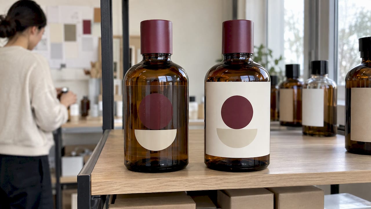
A clear label is printed on transparent film, so the container shows through and the design looks applied directly to the glass or plastic. A white label is printed on an opaque white face stock, so the artwork sits on its own bright base whatever is underneath. Choose clear when the container is clear or light and you want a "no-label" look. Choose white when the container is dark, colored or variable, or when the artwork depends on exact color and fine detail. Clear film can also be given a white ink underprint, which is where most of the real decisions are made.
This guide explains how each option behaves, how white ink on clear film works, and how to specify and approve a label so the finished pack matches the proof.
TL;DR
- Clear labels let the container and product show through. White labels carry their own opaque background, so they look the same on any surface.
- On clear film, the container and its contents become part of your color formula unless a white ink layer restores a base.
- White ink can be laid down in one layer (single-hit) or two (double-hit), depending on the opacity you need and the container behind it.
- Avoid fine reversed type and hairline rules on clear labels, and approve samples on the real container, filled with the real product.
- When in doubt, run a short sample round on both materials before committing to a production quantity.
Table of Contents
- The core difference: what sits behind your ink
- When clear labels are the right call
- When white labels are the right call
- How white ink on clear film works
- Material, finish and durability checks
- A simple way to decide
- How to approve a clear label without surprises
- Our perspective
- Specifying clear or white labels with Yuan Packaging
- FAQ
- Sources
The core difference: what sits behind your ink
Every printed label is a stack: face material, ink, adhesive, and the surface it is applied to. On a white label, the face material is itself the background. Your cyan is printed on white, so it reads as cyan, and a dark bottle underneath makes no difference.
On a clear label, the face material is transparent. Ink on it is partly see-through, so what you see is a mix of the ink and whatever is behind it: a pale lotion, a dark amber spirit, a green glass wall, even the cap color on a curved shoulder. One label-industry guide puts it plainly: on clear labels the container and its contents become part of the color formula unless white ink restores a base.
That single idea explains nearly every difference between the two options.
| Factor | Clear label (no white ink) | Clear label with white underprint | White label |
|---|---|---|---|
| Look on the shelf | Container shows through, "printed on the glass" effect | Printed elements are opaque, the rest stays transparent | Visible label panel with a solid background |
| Color consistency across containers | Varies with container and contents | Much more controlled | Most controlled |
| Fine reversed type | Poor contrast, high risk | Better, if registration is tight | Reliable |
| Best surface | Clear or very light | Clear, light or mixed | Any, including dark |
| Proofing effort | Needs a real filled container | Needs a real filled container and a white-ink check | Standard proof usually enough |
When clear labels are the right call
Clear film earns its place when the product itself is part of the design. Typical cases:
- Glass and clear plastic jars and bottles in cosmetics, where a pale serum or cream is a selling point.
- Spirits and premium beverages where the liquid color, the glass shape or an embossed bottle should stay visible. Our guide to label printing for premium spirits covers the finishing side of this.
- Minimal brand identities where a single mark, a short name or a regulatory line floats on the container.
- Secondary information such as batch codes or a back-of-pack ingredients panel that should not interrupt the front design.
The design rule that follows: keep clear-label artwork bold and simple. Fine reversed type and hairline rules lack reliable contrast on clear film, because the "reverse" areas are simply transparent and take on the color of the container behind. A thin serif knocked out of a dark panel can vanish against an amber bottle and look muddy against a white cream.
Design tips that work on clear
- Use positive type (ink on transparent) at a comfortable weight rather than thin reversed lettering.
- Treat the container color as a fixed design input and decide whether it helps or hurts each ink.
- Keep critical legal text on an area with a stable, light background, or on a white-backed panel.
- Plan the label edge: a clear edge can reveal air bubbles or adhesive flaws more easily than a white one.
When white labels are the right call
White stock is the practical choice when the label has to perform the same way on many surfaces, or when the artwork is demanding.
- Dark or colored containers, where clear film would let the container dominate your colors.
- Dense regulatory copy. Ingredient lists, dosage text, warnings and barcodes must be legible and scannable. A white face gives stable contrast. For cosmetic labeling, see our breakdown of FDA cosmetic label rules for U.S. brands.
- Photographic or tightly color-matched artwork, where a brand color has to be the same on every SKU regardless of what is inside.
- Product ranges that share one label design across several formulas or container colors.
- Serialized or scanned labels. QR and 2D codes need a dependable background. Our pages on variable data and serialized labels and QR code labels for premium packaging go deeper on this.
White does not mean plain. A white label can be uncoated paper, a textured stock, or a filmic white, each with its own feel. If tactile quality is the priority, textured paper labels are worth a look before you default to film.
How white ink on clear film works
Most brands do not actually choose between "clear" and "white" as two separate products. They choose clear film, then decide how much white ink goes under the color. This is the heart of what readers call opaque white printing or white ink printing on clear.
Opaque white acts as a base layer. According to one label-printing source, it restores opacity and contrast to colors and text on clear film, and an underprint is needed whenever you want consistent color or legible text over variable container backgrounds.

Single-hit and double-hit white
White ink can be applied in one layer (single-hit) or two (double-hit), depending on the opacity wanted and the container behind it. As a rule of thumb:
- Single-hit suits light containers and designs where a slightly translucent white is acceptable.
- Double-hit suits darker containers or colors that need to read as solid and bright.
The right choice is a physical decision, not a screen one. That is why a sample on your actual container matters so much.
Where the white goes: underflood, overflood and spot
White does not have to cover the whole label. White-ink printers, such as HP's Scitex FB550 and FB750 flatbed printers with the White Ink Upgrade Kit, support underflood, overflood and spot white modes. In plain terms:
- Underflood: a white layer beneath the color across a defined area, the common choice for opaque panels.
- Overflood: white laid over the color, used when the label is viewed through the film from the back.
- Spot white: white only where the design calls for it, such as a logo or a single line of type, leaving the rest transparent.
Spot white is how a "floating logo" look is made on glass: a white, opaque mark with the container visible all around it. The ink sequence and saturation are set in the RIP software according to media type and viewing intent, which is why a clear label printed for a front view is built differently from one meant to be read through the film.
Material, finish and durability checks
The film itself matters as much as the ink. Before choosing between clear and white, check these factors.
Film surface and ink anchorage
Label films are often corona treated or coated with a print-receptive topcoat to help ink anchor and print cleanly. Ask your converter which treatment the film has and whether it suits the inks and finishes you plan to use.
Stiffness and conformability
Stiffness and conformability are key properties of film labels. Materials such as MDO (machine direction oriented) films are chosen to balance rigidity for application with conformability on squeezable containers. A very stiff film can lift on a tight curve, while a very soft one can wrinkle on application. If your container is a tapered cosmetic bottle or a shouldered spirits bottle, see three tests for labels on curved surfaces.

Gloss, matte and clear laminates
Clear labels can be glossy or matte. Gloss gives a glass-like, high-clarity look; matte diffuses reflections and gives a softer, more tactile impression. On white labels the same choice affects color depth and glare. Pick the finish alongside the container, not in isolation: a matte clear label on glossy glass can read as a deliberate contrast, while gloss on gloss can look almost invisible.
Moisture, oils and handling
Cosmetics and spirits labels face condensation, oils from creams and ice-bucket moisture. Clear film labels are commonly specified for water and oil resistance, but the real test is your own product on your own container. Our guide to sample-first waterproof label printing walks through how to test this.
Authentication and security
If the label also protects against counterfeiting, the base matters. Security features, serialization and tamper evidence all need a stable, controlled surface. See our anti-counterfeit labels and the guide to track and trace labels that survive lamination.
A simple way to decide
Work through these questions in order.
- What color and clarity is the container? Clear or light points to clear film. Dark or colored points to white, or clear with a full white underprint.
- Does the product show, and is that part of the story? If yes, keep as much of the label transparent as you can and use spot white for the elements that must be opaque.
- How much small type and fine detail is there? The more you have, the more you need a white base.
- Does the label carry scannable codes or regulated copy? Put these on a white-backed area.
- Will the same artwork go on several containers or formulas? If so, white or full underprint keeps color consistent.
- What will the label face in use? Condensation, oils, refrigeration and handling should drive material and laminate choice.
Pro tip: If you are torn, design the label for clear film with spot white on the logo and legal panel. You keep the transparent look where it counts and a stable base where legibility matters.
How to approve a clear label without surprises
Screen proofs cannot show how a transparent label will look over a particular liquid. Arrow Systems recommends testing physical samples on the actual container, filled with product, rather than relying only on screen proofs. Follow this sequence:
- Send the container (or a representative one) and a product sample with the artwork.
- Request the same design on clear with different white settings, plus one on white stock for comparison.
- Apply labels to filled containers and review them under daylight and store-style lighting, as recommended for evaluating contrast.
- Check edges, bubbles, curvature and registration after a few days of adhesion, not just at application.
- Lock the film, white-ink mode, adhesive and finish in the spec before ordering the run.
Our perspective
Most label problems we see begin with a decision made on screen. A designer picks clear film because the render looks elegant, and then the real bottle arrives with an amber tint, a seam or a curve nobody modeled.
Our view is that clear and white are two ends of one dial. We work from the container and the product first, then set how much opaque white the artwork needs. Our approach combines traditional finishing craft with modern automated production, so the same facility can handle the film, the white-ink layers and finishes such as foil stamping or embossing, which keeps the whole label consistent.
For premium beauty and spirits brands, we suggest a short sample round on the real filled container before any production run. It is a small step that protects the result you worked to design.
Anthony
Specifying clear or white labels with Yuan Packaging
We manufacture custom pressure-sensitive labels for beauty, spirits, lifestyle, food and regulated brands, with options including foil stamping, embossing and soft-touch finishes. Whether your design calls for a transparent film, a white stock or a clear label with a controlled white underprint, our team can help you settle the specification around your container. Start with our custom label printing range, or see the cosmetic and beauty labels page if your product is skin care or color cosmetics.
If the label is one part of a wider pack, you can also browse the full product range, including rigid gift boxes and folding cartons designed to sit alongside your labels.
FAQ
Are clear labels the same as transparent labels?
Yes, in everyday use. Both mean a label printed on transparent film so the container shows through. How opaque the printed areas look depends on whether a white ink underprint is used.
Do clear labels need white ink?
Not always, but often. Without white, the container and contents show through your colors and text. White ink restores a base where you need consistent color or legibility over variable backgrounds, and you can apply it only where needed.
What is the difference between single-hit and double-hit white?
Single-hit is one layer of white ink, and double-hit is two. Double-hit gives greater opacity, which suits darker containers or colors that need to look solid. Your converter can show both on a sample so you can judge them on your own container.
Which is better for dark bottles, clear or white?
White stock, or clear film with a full white underprint, is generally the safer choice because the dark container would otherwise dominate the colors. Sampling on the actual bottle confirms which route gives the look you want.
Can I use clear labels for text-heavy regulatory information?
It is possible if the text sits on a white-backed panel, but fine reversed type is a risk on clear film. Placing regulated copy and codes on a stable white base keeps them legible and easier to scan.
Sources
- White Ink Clear Label Printing: When You Need It and Why
- HP Scitex FB5x0 and FB7x0 Printers: White Ink Workflow Guide
- Avery Dennison Product Component Guide ANZ 2026
Recommended
- Textured Paper Labels: Choosing Premium Stocks That Perform
- Production Rules for Peel and Reveal Labels for Brand Managers
- Anti-Counterfeit Labels: Security Features and Costs
- Track and Trace Labels That Survive Lamination for Regulated Brands
Are clear labels the same as transparent labels?
Yes, in everyday use. Both mean a label printed on transparent film so the container shows through. How opaque the printed areas look depends on whether a white ink underprint is used.
Do clear labels need white ink?
Not always, but often. Without white, the container and contents show through your colors and text. White ink restores a base where you need consistent color or legibility over variable backgrounds, and you can apply it only where needed.
What is the difference between single-hit and double-hit white?
Single-hit is one layer of white ink, and double-hit is two. Double-hit gives greater opacity, which suits darker containers or colors that need to look solid. Your converter can show both on a sample so you can judge them on your own container.
Which is better for dark bottles, clear or white?
White stock, or clear film with a full white underprint, is generally the safer choice because the dark container would otherwise dominate the colors. Sampling on the actual bottle confirms which route gives the look you want.
Can I use clear labels for text-heavy regulatory information?
It is possible if the text sits on a white-backed panel, but fine reversed type is a risk on clear film. Placing regulated copy and codes on a stable white base keeps them legible and easier to scan.